

@clive I agree with have a disjointed sense of personal risk (sharks etc), but disagree that these charts have anything to do with it.
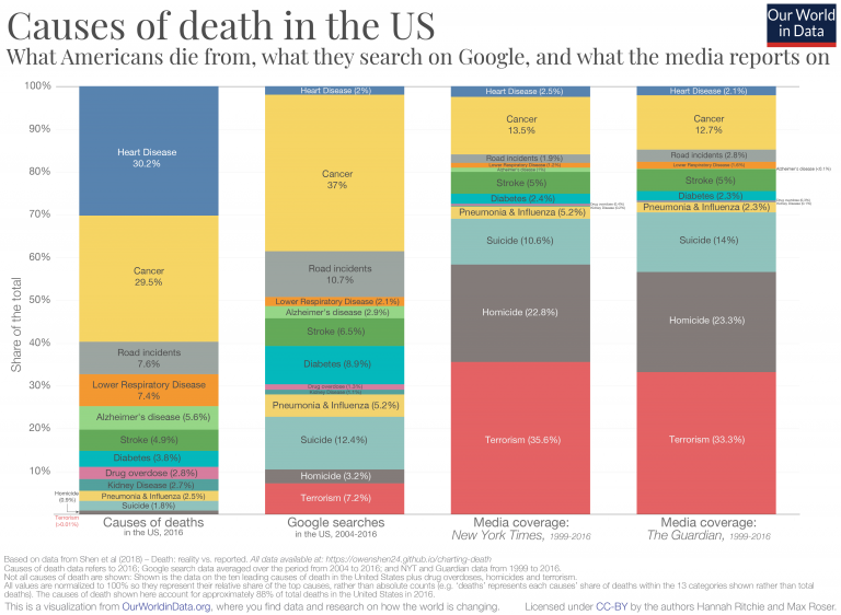
1) It makes a lot of sense for various reasons to search for [cancer] or [suicide], probably not as much [heart disease]. Instead, people would search for things like [lower cholesterol] – was that lumped in those tiny blue bars up there?
2) Some causes of death are more newsworthy than others, and rightly so. 30–40% of people dying from cancer has kinda just been the way it is for many decades. Everyone knows cancer is bad; there's going to be some news coverage of shifts in frequency or new treatments and preventative measures, but what else would you expect to be in the news?
I don't get this idea that we should be collectively wringing our hands about things in proportion to death risk. e.g. of course I want to spend more time in political debates talking about terrorism or homicide than I do about diabetes; that's obvious, right?
FWIW I spend time roughly proportional to the leftmost chart on each cause when talking to my doctor.
