Follow

RT @jburnmurdoch
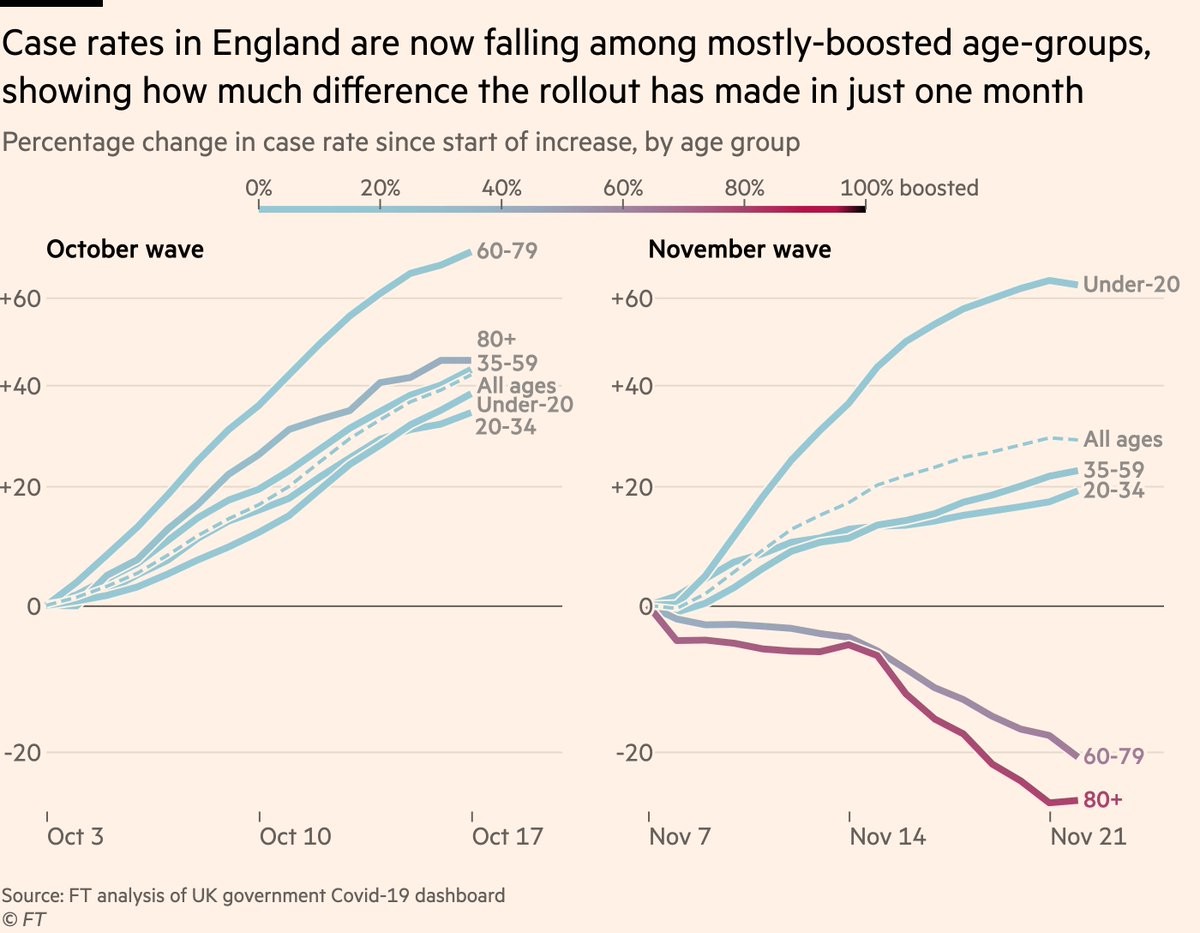
This is a new chart format I’ve been working on for a few days. Lines still show age-groups, but they now change colour as people get boosters.
In October booster coverage was still low even in elderly. But by late Nov you can clearly see how boosters drive cases down 💉📉
