Follow

RT @Joachim27723244
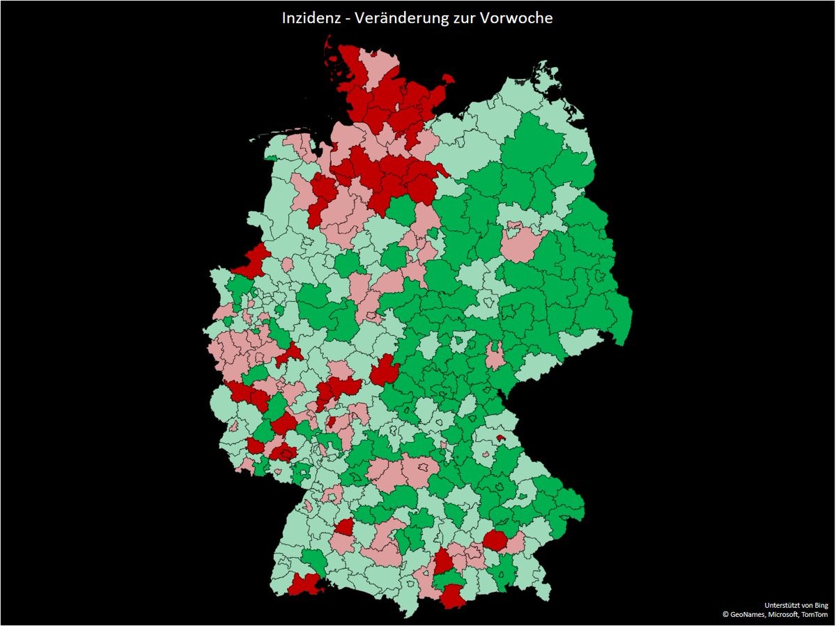
@risklayer Mal die Kreisdaten von Euch (bis auf paar kleine Fehler vllt.) verarbeitet in ner Grafik. Rot = +25 % und mehr Anstieg , hellrot leichter Anstieg, hellgrün leicht sinkend, dunkelgrün über 25 % Minus. Man sieht gut den Omikron-Norden
