
@humanetech @dsfgs @pfefferle @drq @tallship @person @eylul
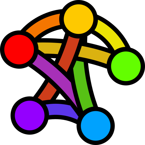
All right, so here goes one idea in all its possible variations. Fist, color:

Follow

>an increasing number of nodes for larger versions
Ooh, some kind of **fractal** pattern would be awesome-sauce! #YearOfTheFediverse
@VictorVenema @nestort @humanetech@mastodon.social @dsfgs @pfefferle @drq @tallship @person @eylul

@VictorVenema
Have a look at the design we just retooted. Do you see a fractal?
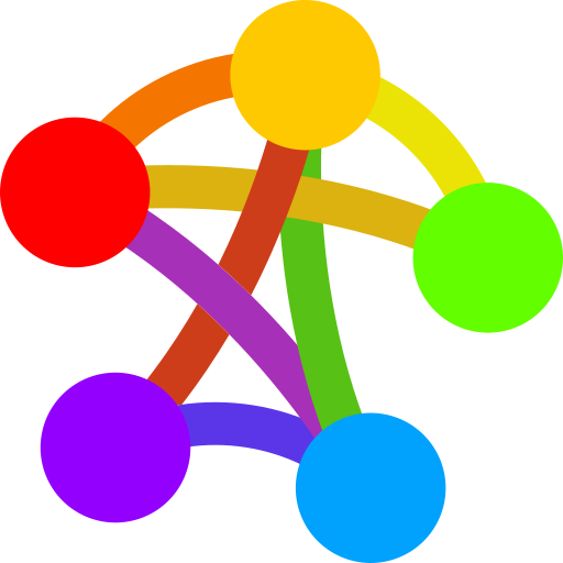
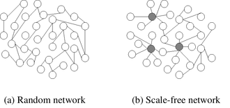
@dsfgs @category_mirrory I do not want to be too much of a scientist, but I see two scales, rather than a scale free network.
https://en.wikipedia.org/wiki/Scale-free_network

@category_mirrory Exactly, with many nodes you could make wonderful (fractal) patterns. But the logo should also work when it is printed small. In the past you could only have one logo, but with this logo mostly being used on the web, one could generated them automatically at any size. @nestort @humanetech @dsfgs @pfefferle @drq @tallship @person @eylul