
33. the subjective experience of a UI is often vastly different from the objective reality of the system, particularly with regards to perception of time and mental models about what the computer is actually *doing* and how it works. The Watched Kettle effect. For instance, shortcut keys *feel* faster but are measurably slower than just using menus. A file copy routine can be made as fast or slow as you like but the *perception* of its speed is down to how the progress bar is animated.
34. The user maintains a mental model of the system in their mind, a representation of the way the system works that helps them percieve situations, respond to situations predict outcomes and solve problems. It’s the software UI’s responsibility to either help the model become more accurate, or intentionally abstract and deflect the mental model from the truth. A user with a wrong mental model making an inaccurate prediction leads to user frustration.
35. the brain structures responsible for human memory and perception of time are wired directly to the amygdala: the seat of human emotion. a session at a computer will be represented by an episodic memory, regulated by the user’s emotional state at different points in time. frustrating experiences will be represented more prominently in memory than “average” experiences. the last experience in the episode is more prominent than experiences in the middle. our memory is structured narratively.
an amusing consequence of #35 is what a study about colonoscopies can teach us about software interfaces.
https://www.fool.com/investing/general/2013/06/30/the-colonoscopy-theory.aspx
#36. the law of conservation of complexity. Every system has an irreducable minimal amount of complexity. The only question is, where will you put the complexity? on the user, the application developer or the platform developer?
#37. https://lawsofux.com contains another numbered list of of principles that amazingly mostly does not overlap with this one.
#38. Gestalt, or “the sum is greater than the parts” refers broadly to the repertoir of tricks the human mind has for completing patterns from incomplete evidence. I could go on and on about it, but i found this great article summing it up along with examples of how it applies to various UI situations
#39. this might seem obvious, but it’s violated enough times to make it worth saying: if you’re making a UI for a touch screen, make the buttons big enough for adult human fingers. Apple reccomends at least 40x40pts
#40. Convention over experimentation.
There are many arbitrary decisions in UI design. for example: where to place the search bar? fundamentally, it doesn’t matter what you do, but if there’s an established convention please use that. Place the search bar on the upper right hand side of your global nav; not because there’s science to back that up but because if you put it there I’ll be able to guess where it is. that’s where most sites put it. Don’t make me search for search.
41. Dark Patterns
Dark patterns refer to the repertoir of UI designs and techniques intended to trick or coerce a user into doing things or agreeing to things either with or without their knowledge. a windows prompt that registered closing the window as agreement to upgrade, prompts that give only the choices “ok” and “later”, or sign up sheets that hide the “skip uploading my contacts” link with a small dim font (twitter). If you do any of these, I think you’re probably a rapist too.
I don’t say that last part to be hyperbolic. lack of respect for other people’s consent runs deep and affects everything you do. Implementing a dark pattern is a fucking sign.
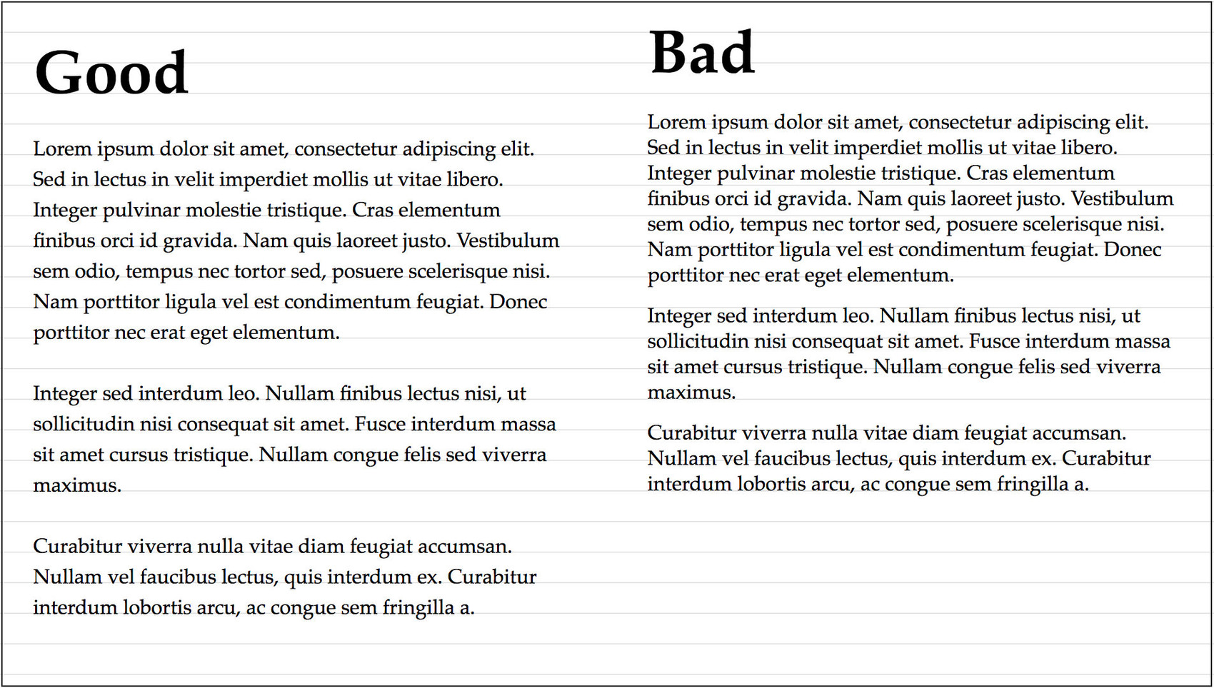
42. for legible body text, optimal line length is 60-70 characters per line. no fewer than 35, no greater than 80. going longer than these ranges makes it difficult for the eye to track back to the beginning of each line. go shorter and reading becomes stuttered, like reading a telegram. or a toot.
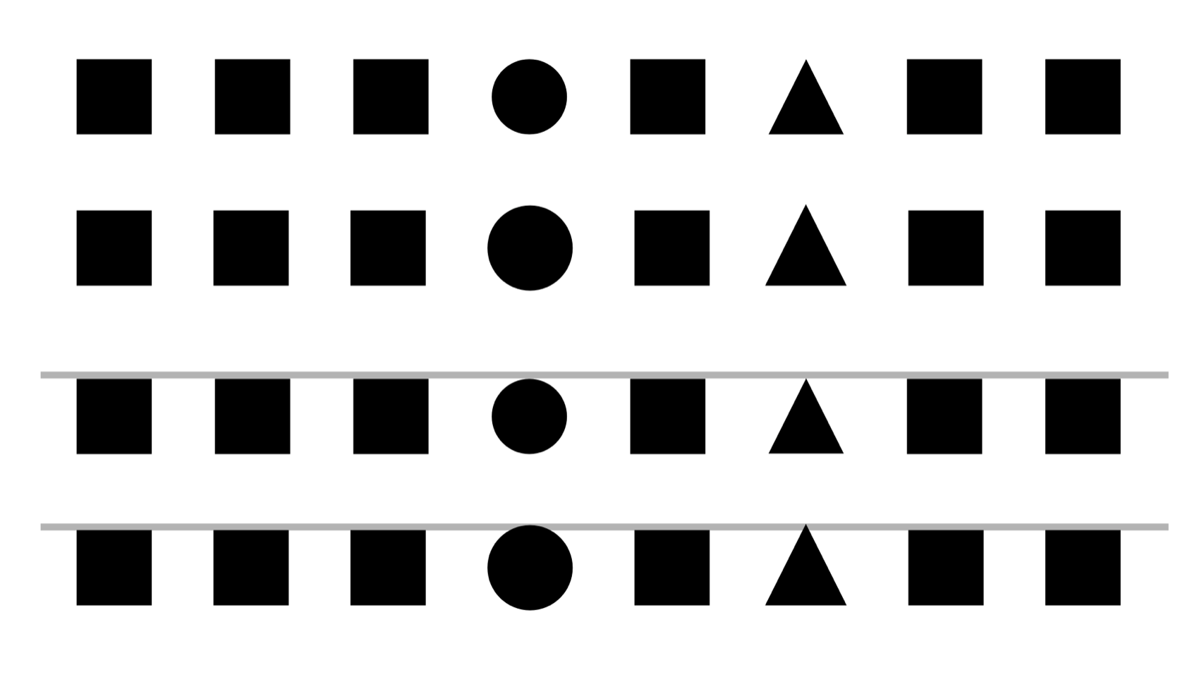
43. The web, and UI frameworks will fight you on this, but if you establish a vertical rhythm in your typographic grid, you’ll increase the feeling of unity in the design and help the eye flow better across the design. Choose a verrical spacing that suits the size and style of your main text font. there’s no hard and fast rules, but it’s good to aim for the vertical spacing to be around 1.33-1.5 the point size of your body text. heading sizes can be neat integer multiples of 1/2 or 1/3 of main
44. Past the age of 40, vision tends to decline at a steady pace. mine certainly has. Us old people can’t really deal with font sizes much below 14pt- which tends to look large and goofy to younger folk. whatever size you choose or however you set up your grid, please gracefully permit users to override your choice, and ideally design and code your thing to not break when this is done. this isn’t just politeness, it’s the law in USA, the UK and Australia, along with the rest of WCAG 2.0
I mean, if you set your website at 10px you’re just invoking the wrath of Stella Young’s ghost. watch your toes.
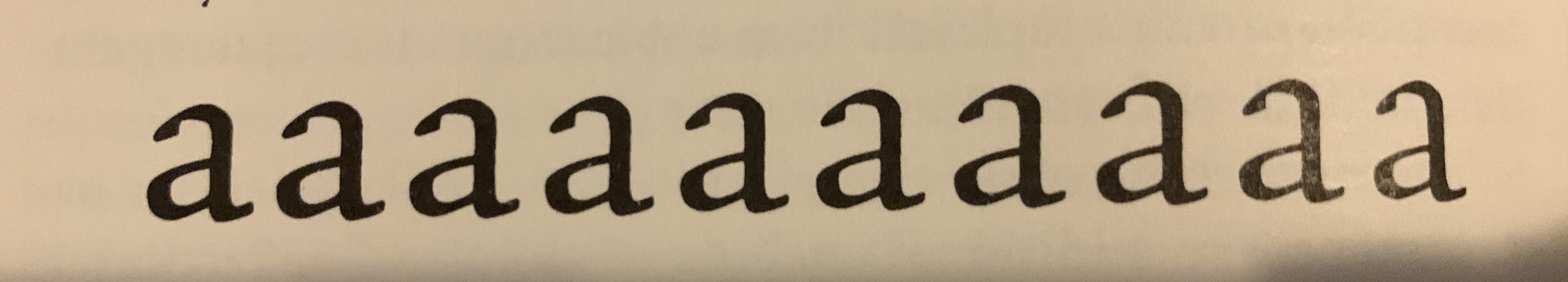
45. in olden times, type was carved by hand into metal for each type size. the different sizes were not just scaled versions of the same design: tiny adjustments were made for each size for color and workarounds for printing technology. With the invention of computer fonts, "hinting" was only done for screens at small sizes, wrong anti-aliasing later accidentally mimicked the effect. Few noticed laser printed documents looked slightly wrong or why. Now retina screens have the same issue.
46. Untitled%20toot%208_FINAL.docx
less a principle than a specific criticism of a ubiquitous concept.
problem: filenames try to be both a programmer interface and a user interface and it’s bad at both. spaces, special characters and long names cause problems for programmers. being overly restrictive causes problems for users. Asking for a filename on file close is the wrong time to ask the user to think about a good findable name- exactly when they’ve just decided to do something else.
47. Optical Adjustment
In the course of creating visual designs, designers very very often accidentally create optical illusions. This usually *isn't* desirable. Objects the same size appear different sizes. Lines that are meant to be straight look curved. The only way around this is to carefully adjust things by hand until they "look right". This is called "optical adjustment"
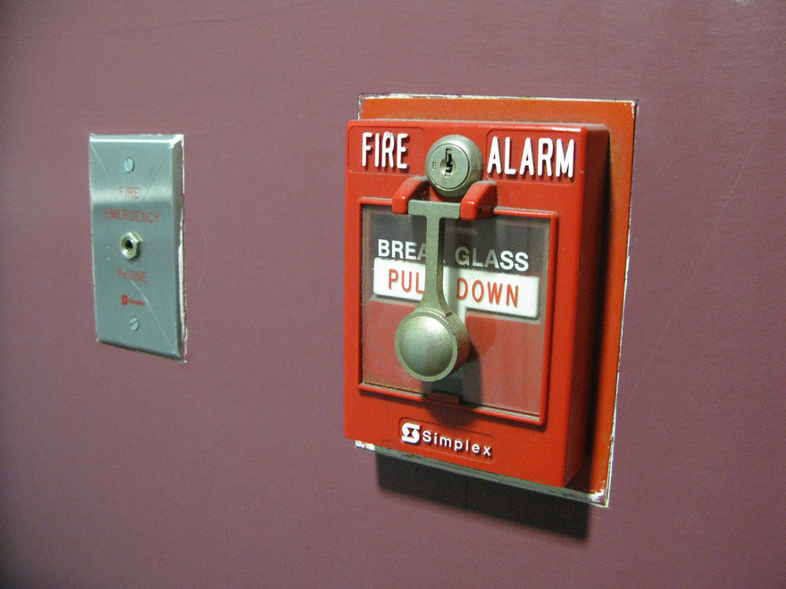
48. Things that work different should look different.
in linguistics, false cognates are words that look and sound similar, with similar meaning, but different origin. false friends are words with similar sound but different meaning. software has false cognates and false friends too. In 2018 they nearly ended the world:
49. Figure-Ground and sillouettes.
The fastest and most well developed stage of visual recognition is of the sillouette of an object. In character design, getting the sillouette of a character to be disctinct is most important. in portraiture if you get the shape of the head right, you’re 90% there. it takes far longer to notice the interior features. time how long it takes you to spot what is wrong with adele. This is important in icon design too- don’t mask all your avatars in circles please
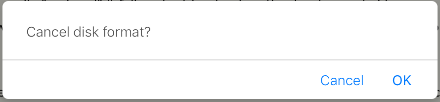
50. We use too many damn modals.
see also: 10., 23, 29 and 30.
need to use a confirmation box?
are you sure?
cancel, okay.
51. Humans make mistakes. It’s no use pretending they don’t. You’re just going to have to deal with it. So just make them easy as possible to fix. Include infinite undo, back button, home button, version control.
Autocorrect, I am not so sure about. I for one don’t like the computer to insist it knows better than me and then provide no way to easily insist i am right. Let me make mistakes! just make it easy to fix them.
52. The Perception - Action Loop.
A principle from psychology, it describes a method by which humans interact and learn from their environment. it goes:
1. Perceive situation
2. make prediction about it
3. take action
4. observe result. if it matches prediction, reinforce that mental model.
go back to 1.
this principle relates to constraints and affordances, in that the perception step can exploit pre-existing experiences, and observing a result can either reinforce or contradict them
54. THE BLANK PAGE problem
-if a user is presented with a blank screen, a blank search field, or a blank page, it can be very difficult to know what to do or what to try. In this case it is better to lead by example, not by patronising tutorial.
55. All manufactured things should be designed to be used by one hand. either hand.
there are safety features of some industrial equipment that require both hands so that both hands are no where near the dangerous hand mangler part- use best judgement
via @space_cadet
56. on Unskippable Cut Scenes.
Game UI seems to live in an alternate universe, immune from both the advances and blunders of mainstream computer interfaces. unskippable Cut Scenes and dialogue bubbles are a staple annoyance for Video Game Afficiandos. What everyone secretly wants is for story cut scenes and dialogues to just be presented with ordinary vhs controls and scrolling text planes to read at our own pace. The game industry is to cowardly to do it for reasons.
57. Negativity Bias
related/mentioned in #35.
humans are wired to notice and remember negative experiences more strongly than they notice or remember positive experiences. negative yelp reviews are more likely than positive yelp reviews. if your software is successful at being easy to use, it will be invisible, and most people won’t remember it.
58. more on episodic memory
ever stand up to do something, walk into another toom and forget what you were doing?
it turns out there’s a reason for this. since human memory is organised around episodes, experiments have found that walking through a door is a trigger for ending an episode- the result? short term memory is cleared and primed for new input.
what triggers exist in software? how often have you picked up your phone to do something, saw a notification and lost your flow?
59. Please don't use confirmation dialogues, but if for some reason you absolutely must, don't sleepwalk through writing the the messages and the button labels. Don't just label them "okay" and "cancel" Without thinking about whether that wording harmonises with the message text. If possible, label the buttons as what they actually do, specifically.
60. Plan for failure
software breaks. hardware fails. services go down. users make mistakes. Anticipate as many failure modes as you can, and design recovery plans and craft reasonable, well written communications for the user. Technical writing is its own topic, but for error messages the important things to accomplish are
a. clearly communicate the situation in language that is relevant to the user demographic. e.g. if it’s not a technical audience don’t use jargon
b. explain what to do next
61. Label your buttons. With words. don’t do clever shit like only showing labels on hover. hidimg the labels is mystery meat navigation.
62. Stop making your updates so intrusive. I open an app to use it. if you force me to stop and update it first i forget what I opened it to do. this is user hostile behavior. Ideally, users should not be bothered about updates at all- but unfortunately they a necessary.
a less intrusive pattern is asking for permission to download and install an update on app EXIT.
just don’t ask using a blocking modal dialog, for the love of durga.
the least intrusive pattern of all is web apps that are just automatically always the latest version, and at worst, occasionally ask you to reload your browser so the front end matches the back end.
this is a tradeoff of course because those updates happen without consent.
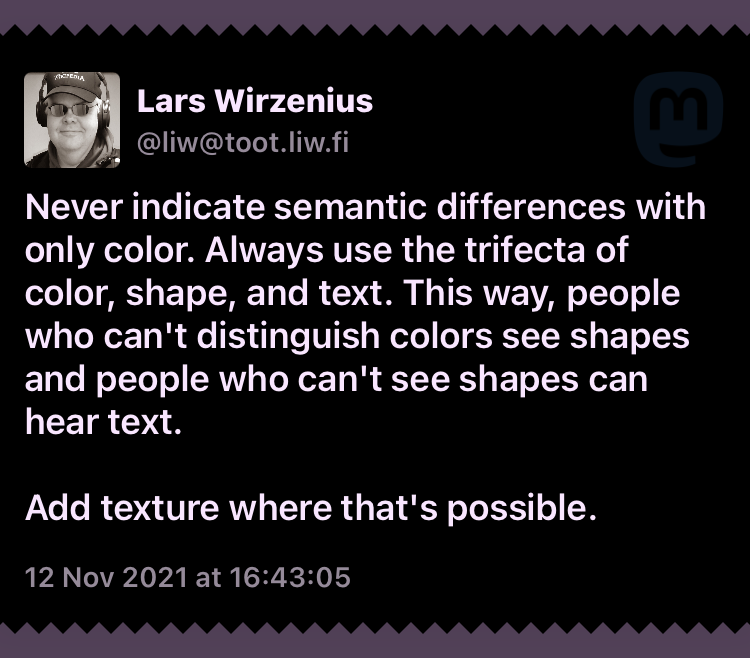
63. Never indicate semantic differences with only color. Always use the trifecta of color, shape, and text. This way, people who can't distinguish colors see shapes and people who can't see shapes can hear text.
Add texture where that's possible.
via @liw
64. never steal focus, never generate a button directly under the cursor, never enable a button immediately after it is displayed, never disappear a button immediately after it is pressed.
65.
IF YOU PROGRAM A "NO" BUTTON TO SAY "MAYBE LATER" YOU HAVE FAILED AT BOTH INTERFACE DESIGN AND BASIC CONSENT
via @HTHR

@zensaiyuki @ecte @HTHR@cybre.space
yes. no. maybe.... i dont know
can.you.repeat.the.question?!
[more nostalgic lyics ensue]
