
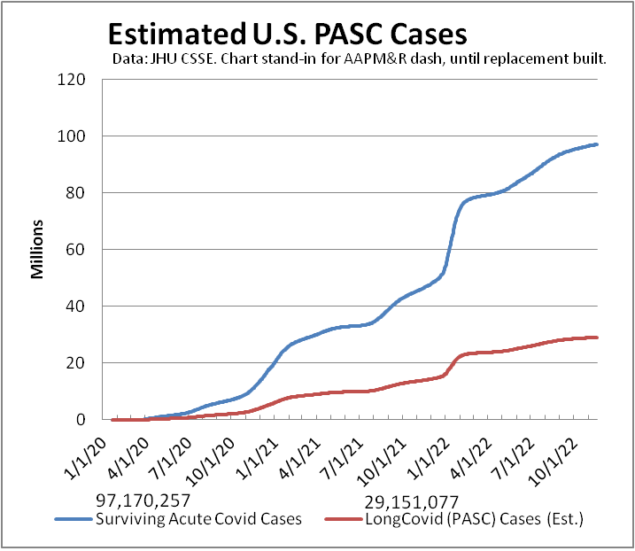
#LongCovid dashboard USpol
Another week, another ~80,000 on #LongCovid dashboard. (Metric depends on testing)
Media reports of 30 million.
Extrapolate latest Census survey—self-reported subset of symptoms—estimate to all ages: ~39 million.
Not counted: new risks of morbidity/mortality.
#ThisIsOurPolio #CountLongCovid
#CovidIsNotOver #MassDisablingEvent
[This is first toot of a weekly thread, updated daily, providing various dataviz of ongoing #pandemic.]
Last week: https://mastodon.social/@beadsland/109339066426302803
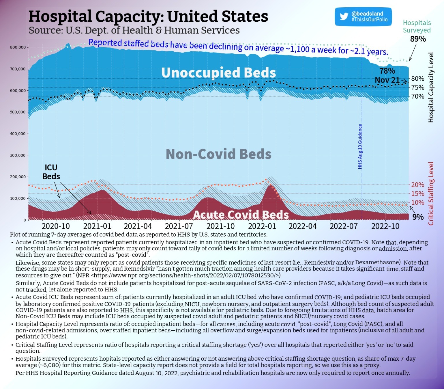
hospital & ICU capacity trend USpol (also dog & food metaphor)
National capacity level holds, as occupancy climbs steadily & hospitals surveyed gains a point.
We're in transition period, ramping into northern hemisphere influenza season, as RSV spreads & Cerebrus slaver-broth Typhon se gang comes to shaggy boil across U.S.
#ThisIsOurPolio #hospitals #LongCovid #CovidIsNotOver #nurses #MassDisablingEvent #CovidIsAirborne #BringBackMasks #dataviz #datavis
pediatric & PICU capacity trend USpol
Pediatric staffing never recovered to pre-omicron levels.
Pediatric capacity level drops a point as non-critical occupancy mirrors plummeting number of beds staffed.
PICU occupancy continues on steady upward slope. More critical patients—fewer doctors & nurses.
#ThisIsOurPolio #pediatric #hospitals #pedsICU #RSV #Flu #LongCovidKids #CovidIsNotOver #nurses #MassDisablingEvent #CovidIsAirborne #BringBackMasks #dataviz #datavis
pediatric & PICU capacity map USpol
Over 282 (-22) counties have pediatric care near or over capacity (≥90%).
Of these, eleven are High "Level"—per CDC—near four in five only rate Low.
Full but Low.
Of 110 counties that report having any PICU capacity, near one-third are full or over capacity.
#ThisIsOurPolio #pediatric #hospitals #pedsICU #RSV #Flu #LongCovidKids #CovidIsNotOver #nurses #MassDisablingEvent #CovidIsAirborne #BringBackMasks #dataviz #datavis
pediatric & PICU capacity rank USpol
Counties by pediatric capacity—colored per CDC "Levels":
#1 🟡Eagle, CO ≥150% (Medium)
#2 🟡Yavapai, AZ ≥150% (M)
#3 🟡Coconino, AZ ≥150% (M)
#4 🟡Oxford, ME ≥133⅓% (M)
#5 🟡Lauderdale, AL ≥150% (M)
#6 🟢Marion, OR—140% (Low)
#7 🟢Florence, SC—136% (L)
#8 🟡Manati Municipio, PR—127% (M)
#9 🟢Fairfax, VA—126% (L)
#10 🟢Wood, WV—125% (L)
[Darkest counties on map tooted above.]
#ThisIsOurPolio #RSV #Flu #LongCovidKids #CovidIsNotOver #BringBackMasks
adult hospital & ICU capacity map USpol
That few beds count as "covid" doesn't mean space is available if you get sick or injured.
Of 96 (-1) counties ≥ 100% capacity per HHS data, only FOUR are CDC High "Level"; just 15 are Medium.
Those ≥ 90% down—266 (-10).
For counties with ICUs, 15% are full.
#ThisIsOurPolio #hospitals #LongCovid #CovidIsNotOver #nurses #MassDisablingEvent #CovidIsAirborne #BringBackMasks #dataviz #datavis

adult hospital & ICU capacity map USpol
@beadsland I’d like to see this adjusted by population in a couple of ways.
One to highlight where there was preexisting undercapacity (under-served areas), and another to highlight where utilization is high relative to initial supply.
If you use a national average per-capita number of beds as the denominator, I think you get the latter, because it removes local supply from the equation.
For the first, perhaps subtracting the local shortfall from the denominator/adding the local surplus? This is an artificial metric; it gives a mix of signals—adequacy + disease burden.
Another way to mix might be to subtract normalized utilization from the actual utilization.
Raw utilization itself is a mix of capacity adequacy and disease burden. This leaves me with the question of contribution of each of these factors, as well as how they may relate.
The existing map is ideal for answering “if I get sick, what will the situation be when i end up in the ICU”, which is certainly an important question to answer!
adult hospital & ICU capacity map USpol
@BobKerns The challenge of per capita is how to reflect differences in rural vs urban coverage areas.
All those areas where there are no ICUs, for instance, are served by regional counties that do have ICUs. Compare a city like NYC, where one one can expect to be at worst transferred to an ICU a few miles away under normal conditions, to someplace in the Dakotas where an ICU may be half a state away. This begs the question per capita of what area?
1/3
adult hospital & ICU capacity map USpol
@BobKerns CDC addresses this partly by having designated Health Service Areas that constitute contiguous areas of multiple counties--this being part of basis for their (very problematic) "Levels" semiotic.
"Underserved" is interesting idea: implies a baseline of population health, in turn a function of socioeconomic demographics. That said, yeah, some counties appear pretty consistently among top 10 each week, which might read as inadequate "supply".
2/3
adult hospital & ICU capacity map USpol
@beadsland Right, I should have said “when I need to be in the ICU”. And yes, “occupancy” is the word I was looking for.
I’m just trying to tease apart the different factors. We can’t do that with a single color scale. Specifically, ‘where is ICU load high relative to population” vs “where is ICU occupancy high because of inadequacy + COVID + other Influenza-Like-Illnesses”.
The first is a better indicator of prevalence; the second a better indicator of the impact of health inequity.
As for rural areas, I was assuming we’d apply the same technique of defaulting to the state values if in-county ICU capacity is not there or minimal.
There are, of course, demographic factors such as age, employment (farm vs sweatshop, to pick extremes) in our multivariate space. These might affect appropriate ICU levels, in different ways—accident rates, disease transmission.
But to begin to answer my two questions, starting from ICU capacity, we need to disentangle adequacy.
I could take a stab at some visualizations; I’m sure I can find county population data easily enough. But attending to my medical issues takes most of my time these days, so I can’t promise anything.
But I wanted to hear your thoughts before trying anything.
Thanks.
dataviz: capacity vs prevalence vs inequity
@BobKerns Whether a county's hospitals are over-capacity due to insufficient resources (which, with more and more leaving the health professions, it's gonna be regardless) or due to overabundance of illness (which, given paucity of NPIs, it now tends to be) is a long term question being applied to a short term crisis.
We're being told "We have the tools," while being presented with CDC semiotics of a map that insinuates hospitals are doing fine.
2/3
dataviz: capacity vs prevalence vs inequity
@BobKerns Now, this is not to say that long-term question is inappropriate or unnecessary.
Being able to figure out where more resources are needed to respond when disease happens (prevalence) vs. where more resources are needed to prevent disease in first place (inequity), is profoundly important. That said, is perhaps not the sort of thing national choropleth is best suited for.
How else to present such a question? Have been thinking cartogram.
3/3

adult hospital & ICU capacity map USpol
@BobKerns My contention is that if ICU or hospital capacity, the why is not the point.
So, for instance, Warren Co., NY is almost always in top 10 overcapacity. Are they high relative to population or high due to infectious disease burden or high due to being an accident nexus?
From a public health perspective, the only question that matters is "Do they have the resources to handle yet more stress?" If the answer is "No", then what's our response?
1/2