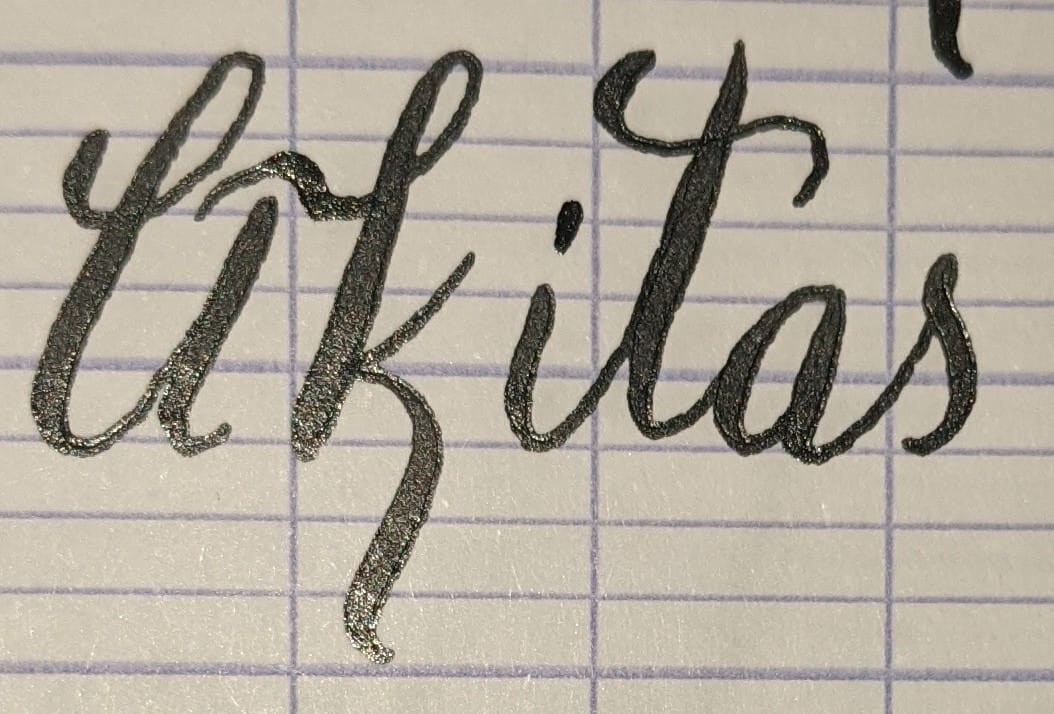
New style for both the capital A and lowercase K here. Thoughts?
#calligraphy #handwriting
@freemo Capital A is a bit difficult to read, but the k is downright pretty.
@freemo that lowercase "k" rocks
the uppercase "A" scans a bit like a lowercase "li" to me
@bonzoesc Agreed, see my post with an updated version.
QOTO: Question Others to Teach Ourselves An inclusive, Academic Freedom, instance All cultures welcome. Hate speech and harassment strictly forbidden.


@freemo Capital A is a bit difficult to read, but the k is downright pretty.