@ct_bergstrom The senior author (full disclosure: my advisor) would like people to note that these are scatterplots of ranked data, which when visualized almost always look like noise…

twitter.com/orielf/status/1623

I’ll note that people not affiliated with our lab have also pointed this out — it’s even in the figure caption, not that it seems like anyone’s reading the paper before dunking on it.

twitter.com/solomonkurz/status

Follow

@psychNerdJae @ct_bergstrom

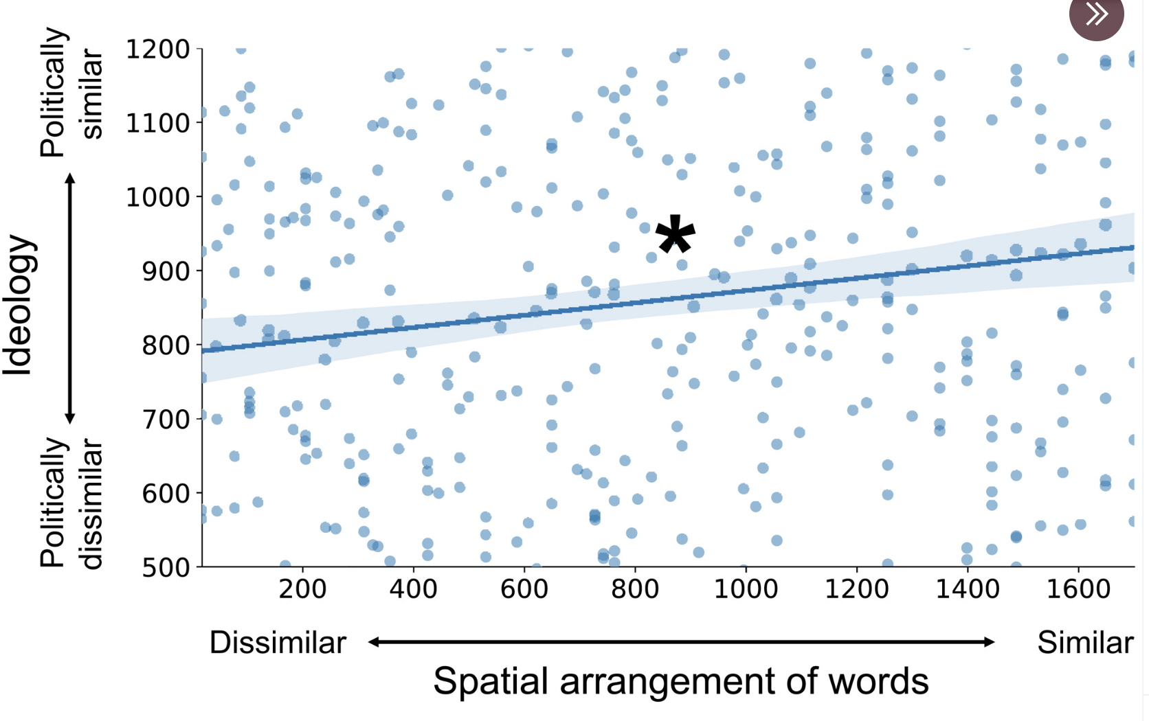
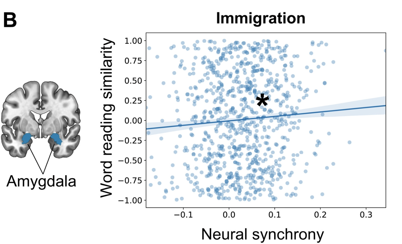
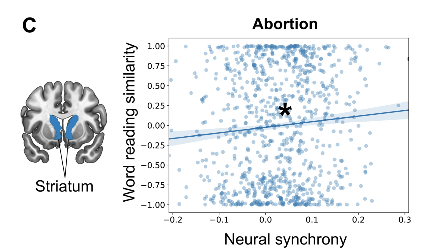
You can scatterplot everything, but that doesn’t mean it makes sense. Especially plotting ranked data doesn’t. In the best scenario, it’s waste of time, for both authors and readers.

Also, linear regression is the wrong method to analyze such data. None of the assumptions were met!

But, IMO, the problem is field-wide: correlation study instead of an experiment, no data analysis plan at preregistration, no power analysis, non-random sample, no clear relation between theory and operationalization, big potential for p-hacking and so on…

Sign in to participate in the conversation
Qoto Mastodon

QOTO: Question Others to Teach Ourselves
An inclusive, Academic Freedom, instance
All cultures welcome.
Hate speech and harassment strictly forbidden.