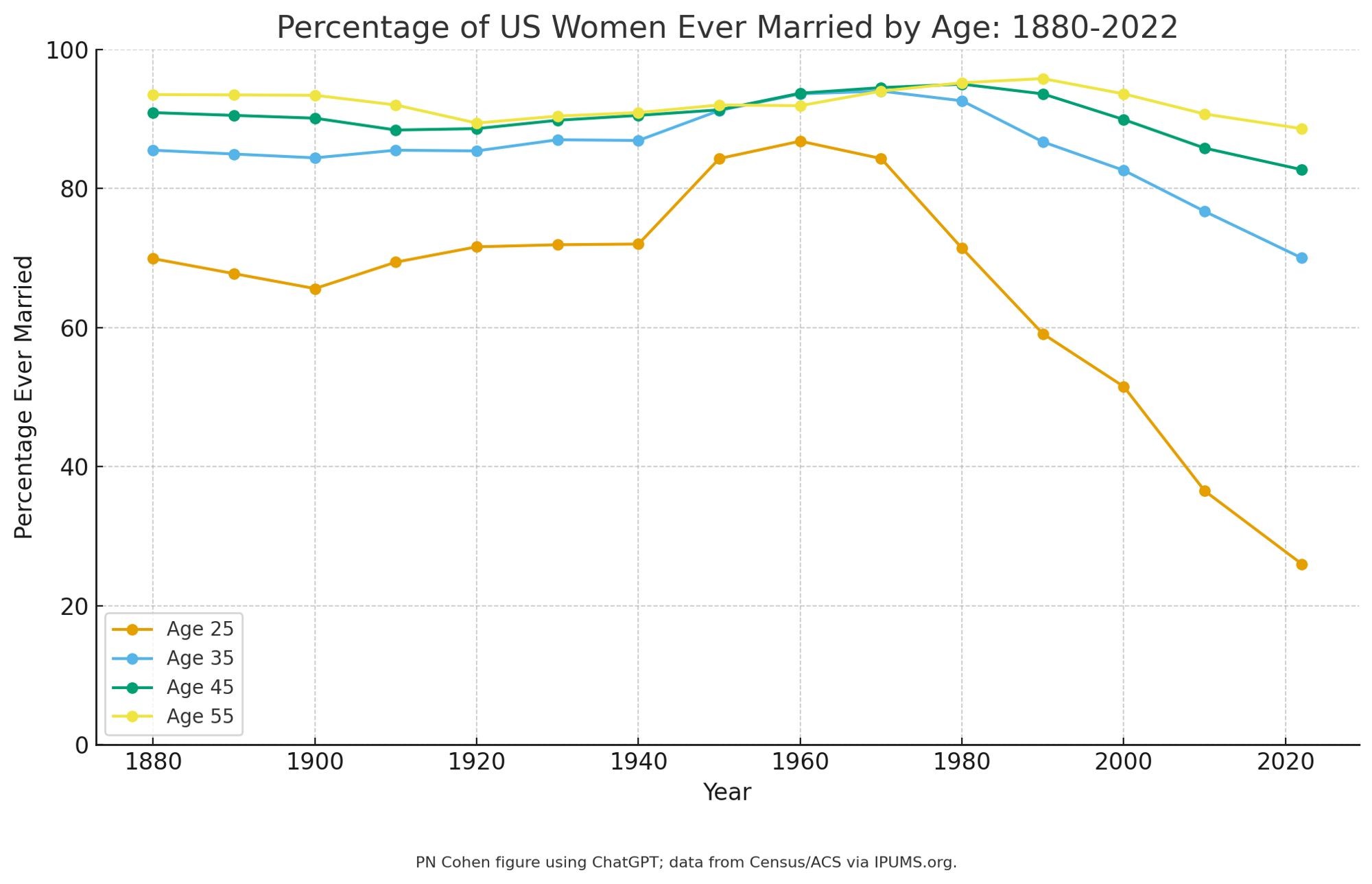
Huh, you can make graphs with #chatgpt. Took three prompts: first paste in the data points; then asked for more colorblind-friendly colors; then asked for a 0-100 y-axis and gave the footnote. It chose the graph style.
@philipncohenDoes the behaviour change any if you plot married women per 100k women?
QOTO: Question Others to Teach Ourselves An inclusive, Academic Freedom, instance All cultures welcome. Hate speech and harassment strictly forbidden.


