
I was actually surprised I didnt get some pushback from our users on the new instance tickers in our UI. Personally I love it but I expected a few people to complain. But literally everyone who registered an opinion said they loved it.
Though Rob is in the dark theme where it doesnt exist, so i guess he isnt a fan.

@freemo LOL....
I am glad we kept the Full Width Dark Theme pure as it's delightful.
Less distractions, I say. 😛
@design_RG To each their own. Keep in mind we have a pure version of our default light theme too (same exact theme just no ticker, just like it used to be). So I was mindful of that.
I will likely do the same with the dark theme at some point. Add the tickers to it but copy the current one so you can still use a no-ticker version as a theme if you prefer.
I'm all about lots of features but giving the user the option for the look to be whatever they want.
@freemo What I really think is unique and highly valuable -- and VERY uncommon, as I have only seen it here and at Todon.nl, is to have a theme that uses the Wide screens in our laptops properly.
Geez, that is one sore point, I have to get back into a campaign for promoting that.
The AWI setting does add some use to the wider screens, but it's too much like TweetDeck (Eugen's admitted inspiration for its design). And the columns widths are TOO Skinny, unless you want 4 columns with fast updating going on, it's a pain.
The modifications you implemented here, (and that they have at Todon and no other instance that I have seen yet), these really allow for good use of the screen width.
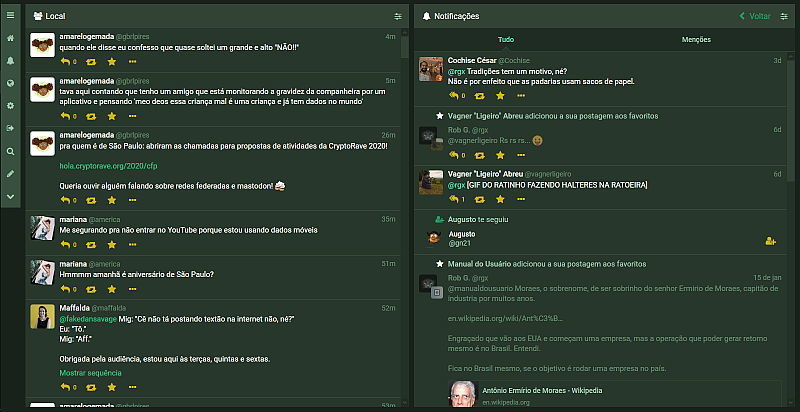
I like my screen as Two columns -- one being the local timeline (at the left), the other containing the Notifications, or one of the other possible timelines (Home or God forbid, Federated madness).

@design_RG Very nice! I like the green better than the default muted colors myself. For light stuff I always go white but for dark stuff I need a little color.