
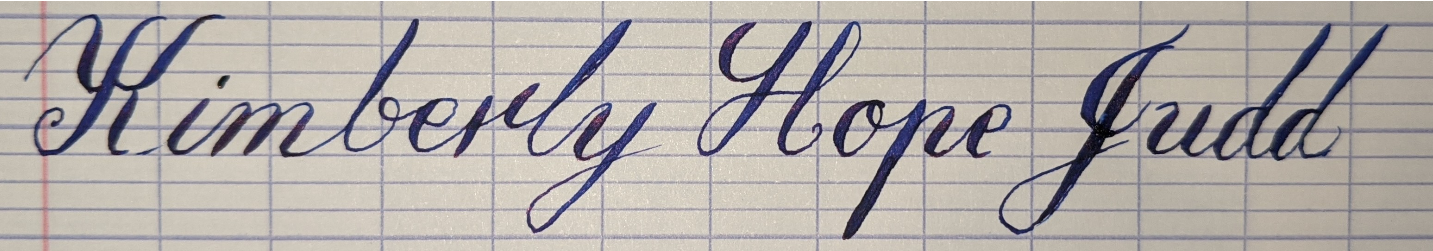
An attempt at some Italian hand Copperplate calligraphy i just did for my sister.

@khird
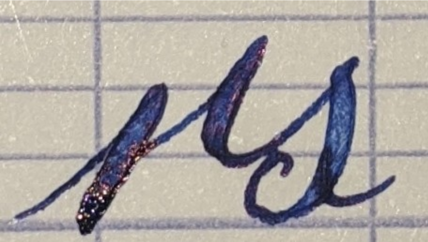
It is the preceeding letter strictly speaking, i just cheat cause it looks better with the half r. Anyway here is both
@khird
You will find i often break the rules on when i use one r or the other just based on what i like. But if your all about doing it right then yea its the leadin that makes the difference.
@khird
Sorry got the perportions off a bit in the last picture. This one is better.
@freemo That's fair; I'm less worried about following a particular set of rules than finding something that works, i.e. is legible, convenient, and hopefully visually appealing. The rules tend to be a good starting point, though - in this case, the full R is more legible following high-ending letters, but the half R is more convenient elsewhere.
Your example is actually really helpful - the trailing stroke of the R pinches closer to the bottom of the S, and the loop at the bottom of the S is larger, than I tend to draw. Accordingly, the S doesn't look like it's floating off in space like mine do. Very nice, that gives me something to emulate!
@khird
Yea a full r leading into an s is tricky. My oersonal rule is this.. if you have a high lead in the. Use a full r, if the following letter requires a low lead in (like an s) then use the half r. If the r has a high leadin and the next ketter requires a low lead in, then use the full r.
In all other cases use whichever r you prefer, for me that is full r.

@freemo Ah I thought it was the *preceding* letter *ending* low that indicated the use of the half R, not the following letter beginning low. Makes sense, thanks!