
Can I get some feedback on a static website im designing for my new company? Would love to get some feedback on asthetics.
It doesnt have much for content (what is there is mostly just to take up space. But would love an opinion on the logo and the look and feel. Also check out the article "our new home" to get a sense for all the layout features it has so far.

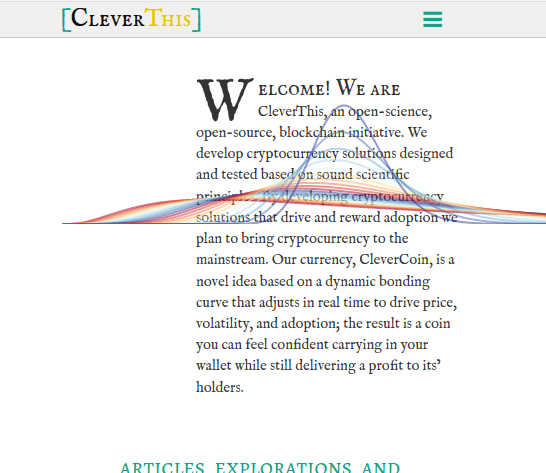
@freemo I'd say too much text, too tiny, in too little space, laid out on some too wide paragraphs. All this make it pretty hard to read. (Sorry for the bluntness, I'd say the same to myself if that were the case.) Also, this happens when reducing the window width:
@tagomago that only happens if you reduce the window after it loads right?
No worries on the bluntness, blunt advice is what I'm after.. do you think the solution is simply a larger font size?
@freemo Exactly, after loading. I know next to nothing about responsiveness myself.
I would definitely enlarge the text size and line spacing, and also set it on narrower columns.
@tagomago yea the behavior of the lines animation is expected. I can fix it easy enough though.
I am uploading a new version now with better fonts.. in a few minutes let me know if it looks any better.
