
Can I get some feedback on a static website im designing for my new company? Would love to get some feedback on asthetics.
It doesnt have much for content (what is there is mostly just to take up space. But would love an opinion on the logo and the look and feel. Also check out the article "our new home" to get a sense for all the layout features it has so far.
@stuehieyrs yea calibre has a nice clean whites and greys look too... good site.
Glad you liked it, thanks.

@freemo decent. it has a very plain benign vanilla feel.
@neotoy good vanilla or bad though? I like "clean" webpages without much razamadaz :)

@freemo
I sweeped through the website on my phone with Chrome, Vivaldi and Fennec(Fennec has text riseze override). The website is very good in it's basic appeal and simplicity. The choice of colour pallete seems strange but not bad. The default text size is too small in my opinion while the font and overall it looks good but readability wise it seems bad. Rest all seems good, I like the animation on the homepage (just shift the animation a little away from the text ![]() )
)
@mur2501 yea too small text size is the #1 complaint im hearing so ill have to address that. Thanks.
@freemo
Also maybe some easter egg titties in the plain vanilla website would be a cherry on the top ![]()
@mur2501 sometimes I worry about you...
@freemo
well truly easter eggs in a website aren't a bad idea ![]()
Also your logo looks like that of Adult Swim with colours added ![]() (and different font)
(and different font)

@freemo
It looks clean and beautiful, the design itself gives a sense of clarity and reliability that works to counteract the vague distrust a lot of people feel just from a mention of cryptocurrency.
The logo is stark and simple, maybe too stark for the general public. (Also, I have a vague feeling I've seen a similar logo somewhere else - a documentation page, a mathematical site, a wiki, something like that. But I can't find which one.)
Like with your personal site, the fonts seem too small to me, the announcements almost look like footnotes.
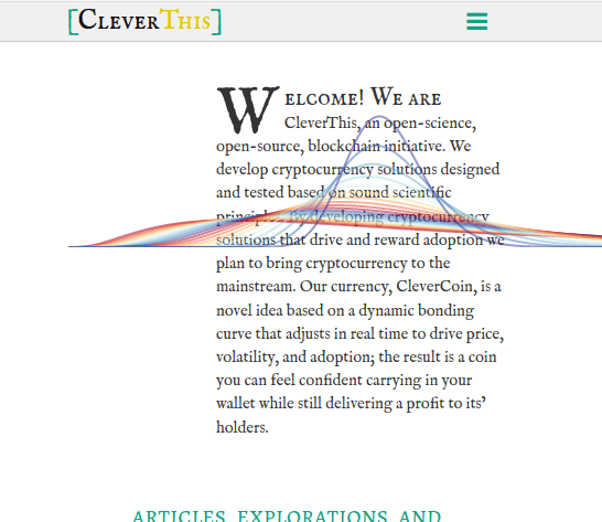
Btw, the graph on the top left (pretty neat!) doesn't load if we have JS disabled, and instead there's just empty space. Perhaps a fallback static image for the noscript case there?
@digital_carver yea not sure what to do without js just yet.. and i agree the font needs some tweaking. Thanks.
@freemo
Just looked at the article page, looks pretty good. The contrast between the smallcaps first line and the tiny subsequent lines looks a bit messy, so the page should look even better once the fonts are fixed. Also, IMO there's a bit too much margin space, both on the left and the right (beyond the margin notes column). Just 10-20% more content would make the page feel less empty.
There's a weird rendering issue with the stylized first lines (in Firefox on Linux), the "A" plunging into the first bullet, pic attached. It's transient - it goes away if I zoom in or out, and doesn't come back even if I get back to the original zoom value. But it's there if I reload the page.
@digital_carver margins are tricky. if i make them too small it becomes harder to give a good user expiernce on medium sized screens... but i will try tweaking it a bit.
The example you are showing is particularly ugly because the first paragraph is a one liner followed by bullet points. I should probably have it not render in that case (i can turn that off with a shortcode).
@freemo
actually, it's weirder than that. It's there if I reload the page and let it load, but if I scroll down while it's loading, the "A" shows up at a normal size and the issue doesn't occur. If I don't scroll down, I can see that the "A" that's rendered is actually larger in size, and that's why it messes with the bullet below it.
This is such a heisenbug it's probably not worth hunting down, especially if it doesn't happen on Chrome.
@digital_carver good to know.

Website looks well made though.
@Destiny nah thats a common complaint. going to have to increase the font size.

@freemo If you want my honest opinion... It looks pretty messy...
There is just too much going on everywhere to stay focussed on reading a single thing.
Also minor sidenote, your fonts overlap on the "Our new Digital Home" article.
@finlaydag33k interesting, that isnt how it rendered for everyone else.. what browser and resolution you using?
@freemo Firefox (90.0.2) on a 1080p display (viewport is 1902x956).
Frankly enough, if I zoom in 1 tick, and then zoom out 1 tick, it's completely fine.
@finlaydag33k does it load broken like that right away or only after resizing?
@freemo loads up broken.
@finlaydag33k thanks ill see if I can replicate, very helpful.

@freemo I'd say too much text, too tiny, in too little space, laid out on some too wide paragraphs. All this make it pretty hard to read. (Sorry for the bluntness, I'd say the same to myself if that were the case.) Also, this happens when reducing the window width:
@tagomago that only happens if you reduce the window after it loads right?
No worries on the bluntness, blunt advice is what I'm after.. do you think the solution is simply a larger font size?
@freemo Exactly, after loading. I know next to nothing about responsiveness myself.
I would definitely enlarge the text size and line spacing, and also set it on narrower columns.
@tagomago yea the behavior of the lines animation is expected. I can fix it easy enough though.
I am uploading a new version now with better fonts.. in a few minutes let me know if it looks any better.
@tagomago thanks for your help.

@freemo nice, like the font even if it runs against the HYPER HIGH TECH BLOCKCHAIN vibe.
The rainbow curve playing out on open is really nice too.
Only used mobile version
@skells thanks.. i just pushed a change with slight tweaks to the fonts that should be live in about 5 minutes.

@freemo this is obviously subjective but I really don't like seeing so colors that don't go well together being so close on the ui elements. For example, green, yellow, white and black in "[CleverThis]' and then bluish/red curves right below it. Also, at the bottom of the page the red and green don't go well together. Again, this is just my personal opinion.
@zpartacoos No offese but I am curious if you are color blind. You mentioned the color green when its closer to a light blue or cyan.
@freemo just to make sure we're talking about the same thing. Are you telling me this is actually cyan?
@zpartacoos yea I'd say so, but in your defense it is close to the line between green and blue if you had to pick one.
@freemo fair enough. I showed it to some else and she first said green and after looking at it more said blue so idk anymore
@zpartacoos its probably right on the link of green and blue, abouthalf of each if i had to guess. So a green-leaning cyan :)
@freemo to me what's on the page looks very much green. I.e very different from the color below.
@zpartacoos I'd say its close to one or two of the shades in the bottom left part of that image actually. particularly the ones that lean closer green.
@freemo yes, I can see that now.

@freemo it looks clean and nice to me. I like the theme, the curve drawing is flash and cool. The small print things at the bottom look great. Hooray for static sites!
I'm browsing via chrome on an Android device - no noticed render issues.
@finity Thank you.

@freemo
Over-all aesthetic is pretty nice, although the first paragraph is a little squished on mobile, due to the curvy lines. The rest looks completely fine though.
@ScumbagDog Thanks, yea im thinking of deactivating the lines on mobile.

@freemo Looks like the web UI of calibre web (https://github.com/janeczku/calibre-web) which I personally am a great fan of.
Blog posts give a feel of reading research papers. 10/10 for that.