
Follow

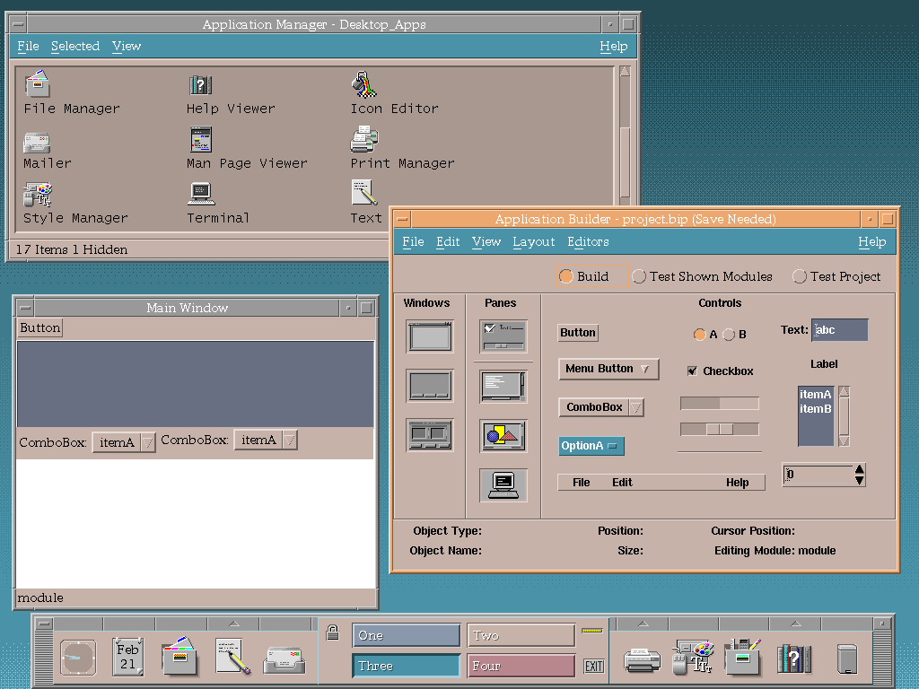
@bonifartius you mean UIs like the Common Desktop Environment? I used that at a workplace, and then at home for a bit when it was open sourced a bit later. It was fun for a bit, but I do think modern UIs have improved on it since then.

@khird yes. most stuff today feels like if it's build for tablets or phones which are an environment made for consumption of things, not for productivity.. i like my interfaces to be brutalist. it's like touch interface on a stove vs. good old dials. touch may look sleek, but is horrible to use for cooking.