

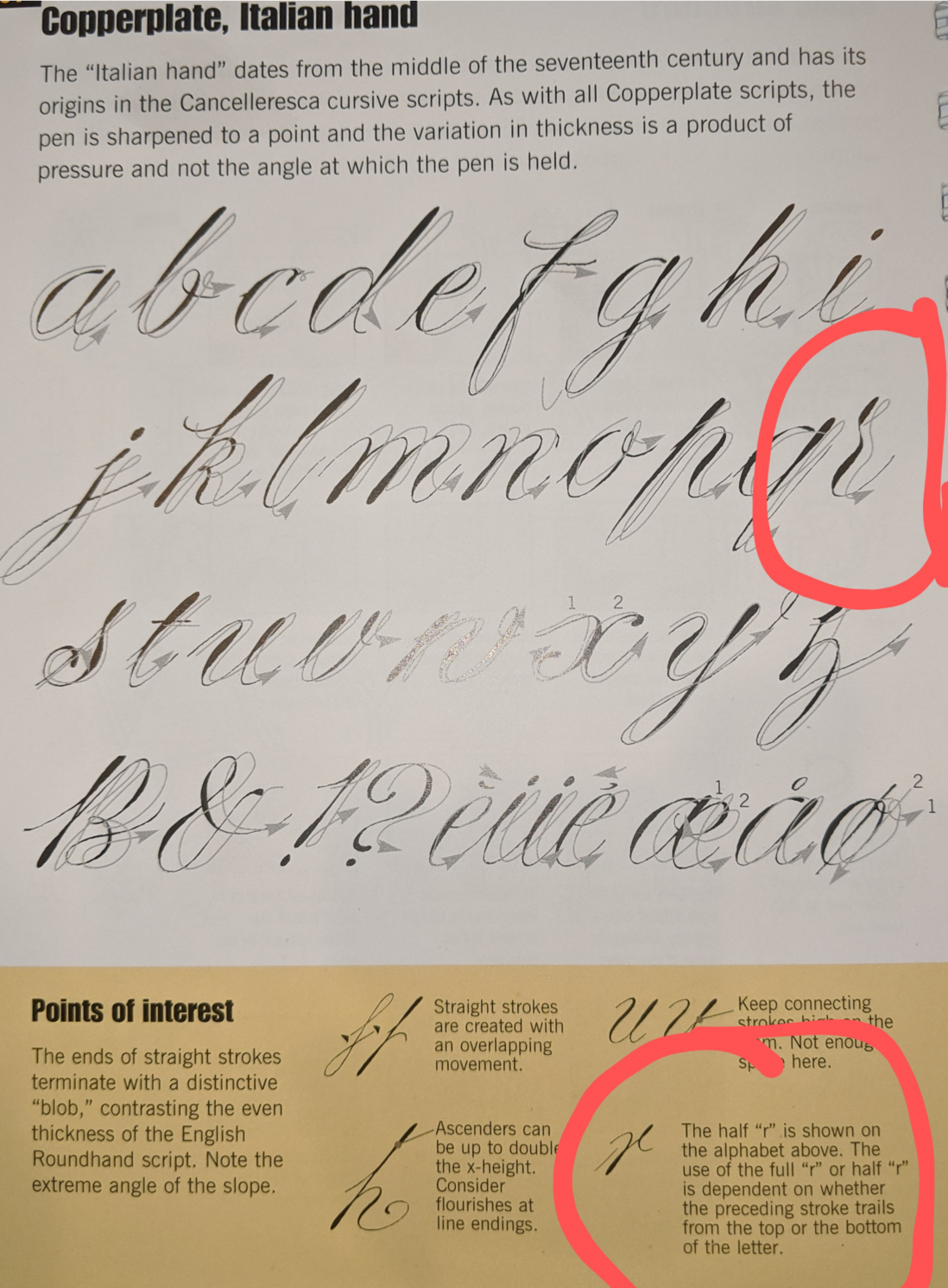
Here you go. This is italian hand variant but the variants are all very similar and all have these two types if its proper copper plate.
@freemo Thanks! That's close enough - I was trying to see how high the second heavy stroke reached. Looks like roughly the same height as the dot on the i.
I don't really enjoy calligraphy the way I think you do, but I think it's important to write legibly and that looks like a rather more recognisable letterform than the half r I ordinarily use. So I might try incorporating it in my Zaner-based cursive. I already use other styles for a few letters (the Zaner G in particular is contorted to a silly degree).
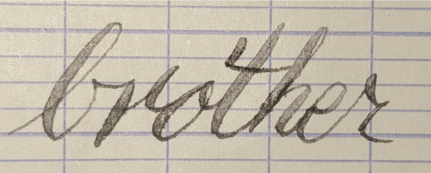
@khird Yea its more recognizable and more versatile. Try a leadin from a lowercase b to a half-r, its horrific. half r only works when the leadin is from baseline. try writing brother with both types of r but in your own hand, like I did, the try reversing the two letter r, you will see why usually we keep both.

@khird I think you mean exemplar? yes give me a minute ill find it and take a picture.
Keep in mind "cursive" isnt really a font.. there are many types of cursive. What style of cursive were you taught, some only have a single simple r I'm sure.. paritcularly the simplified cursive they teach little kids like the palmermethod... But generally if your taking handwriting you are working up to whats called copper plate cursive, at least if your using a fountain pen. which is the form all other cursivies are simplified from. In copperplate you have both forms of r... hold on let me show you an exemplar will help