
Did you know copperplate based cursive has two distinct forms of r that are interchangable depending on what letters are around.
Below is an example, thr first r is a full r and the second is a half r. I bet you were only taught the half r in school and have been doing it wring this whole time. The two forms of r are standard practice and proper copperplate generally shoukd include both in the appropriate places.
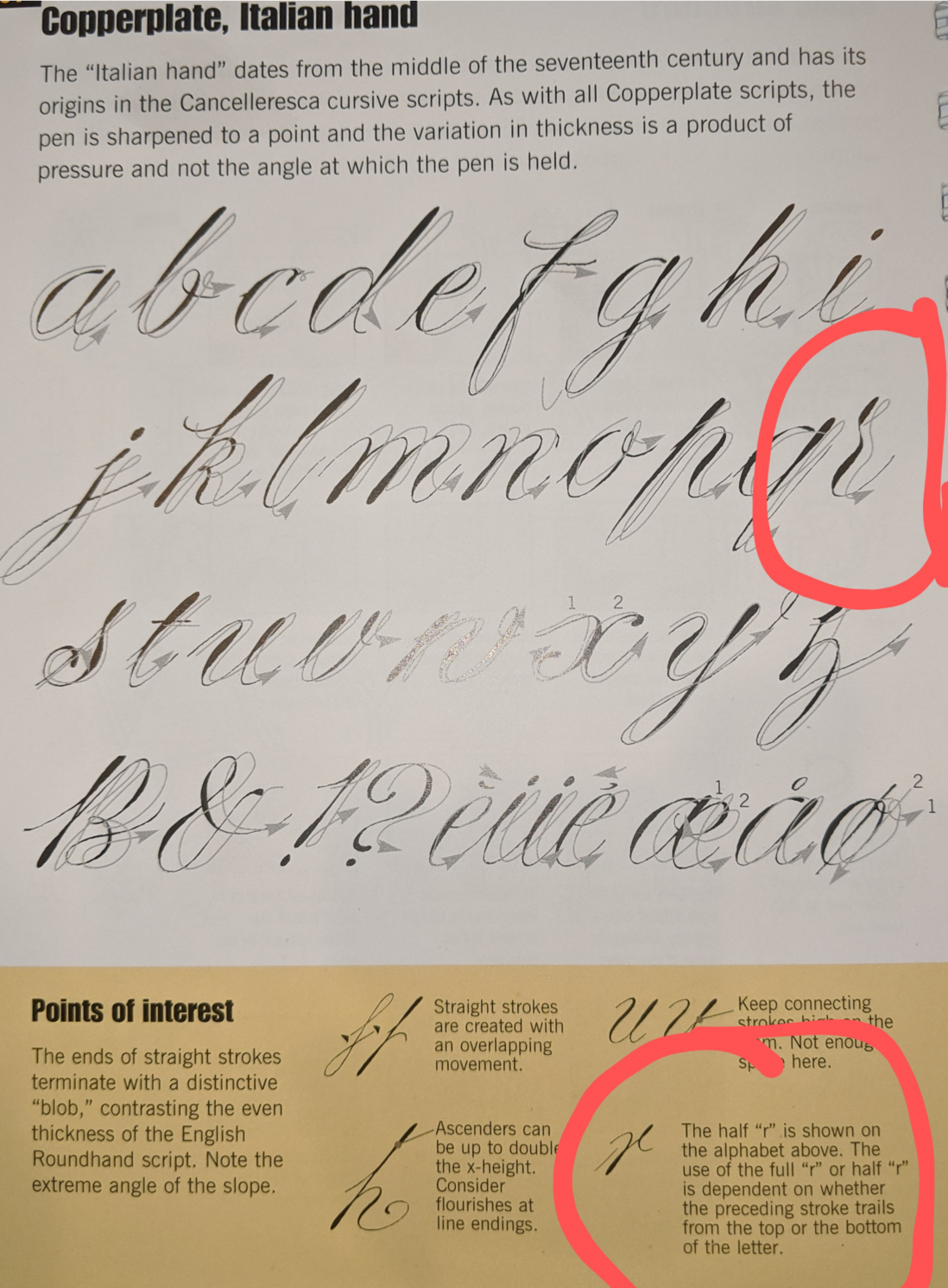
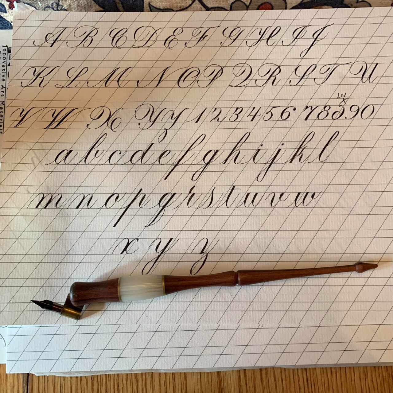
@khird I think you mean exemplar? yes give me a minute ill find it and take a picture.
Keep in mind "cursive" isnt really a font.. there are many types of cursive. What style of cursive were you taught, some only have a single simple r I'm sure.. paritcularly the simplified cursive they teach little kids like the palmermethod... But generally if your taking handwriting you are working up to whats called copper plate cursive, at least if your using a fountain pen. which is the form all other cursivies are simplified from. In copperplate you have both forms of r... hold on let me show you an exemplar will help
Here you go. This is italian hand variant but the variants are all very similar and all have these two types if its proper copper plate.

@freemo Thanks! That's close enough - I was trying to see how high the second heavy stroke reached. Looks like roughly the same height as the dot on the i.
I don't really enjoy calligraphy the way I think you do, but I think it's important to write legibly and that looks like a rather more recognisable letterform than the half r I ordinarily use. So I might try incorporating it in my Zaner-based cursive. I already use other styles for a few letters (the Zaner G in particular is contorted to a silly degree).
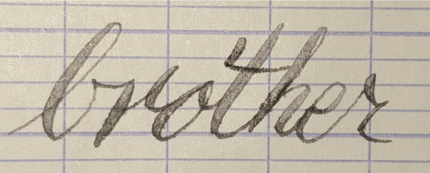
@khird Yea its more recognizable and more versatile. Try a leadin from a lowercase b to a half-r, its horrific. half r only works when the leadin is from baseline. try writing brother with both types of r but in your own hand, like I did, the try reversing the two letter r, you will see why usually we keep both.

@freemo ha. try telling my first-grade teacher
@2ck in first grade you probably didnt learn "proper" (aka copperplate) cursive yet. You were probably taught a simplified form as most kids are.. likely palmer method

@freemo Copperplate looks incredible. I need to find a pen to make the shadded lines, or make the edge of my pencil flat!
@vital876 Making the edge of your pencil flat wont help you do copperplate. For copperplate you use flex-nib, the flat-nib you describe is for gothic scripts. You cant really interchange them too easily.
Now with that said you can get something that looks a bit like flex out of a pencil, but you dont do it by making a flat tip. As I understand it you can get the effect with a normal tip but you place the paper on something soft, this gives the illusion of flex by allowing you to vary the darkness and thickness of the line a bit. Your choice of pencil hardness is likely important too but since I never used a pencil to do this I cant really say.
@freemo That's good advice. Do all of the letters require changes in darkness/thickness, or only some? Another question: how many years ago did you start writing in the Copperplate style?
@vital876 copperplate doesnt strictly require there to be line variation at all, and even if it did, who cares, write in whatever style you like.
Many people will write in copperplate without utilizing the flex, even professionals far better than me sometimes prefer that style. So no rule saying you need flex.
With that said if and when you are using flex, then yes, typically there is variation in every letter and every stroke.
@freemo I'm definitely thinking about practicing this style. It might take a month or two for me to write convincingly in the style, and I might have to invest in a pen with flexible tines. But one day.
Do you by chance have any writing samples in the Copperplate style you could direct me to? One that has a good mix of letter connections, punctuation, figures, capital letters, spacing, paragraphs, and shows how it would look in normal writing? I don't mind searching for it, but if you had one?
@vital876 If you have never written in any sort of flex style you may have trouble picking it up in only a month, but give it a go and see where you wind up. A lot of what you need to learn or figure out is what pen to buy, what ink, what paper, and then learn to use them. Flex pens really are tricky to learn at first for many. Though it may not be too hard for you to learn it in its non-flex form.
I've attached for you a copperplate exemplar showing its 3 major forms without any flex. I've also attached one that shows some simplified forms that shows the flex. There is another showing the typical and cheap dip pen usually used and the script with it. Keep in mind i use a fountain pen but good flex pens in fountain pen form are very expensive so most people stick to dip pens (not me :) )
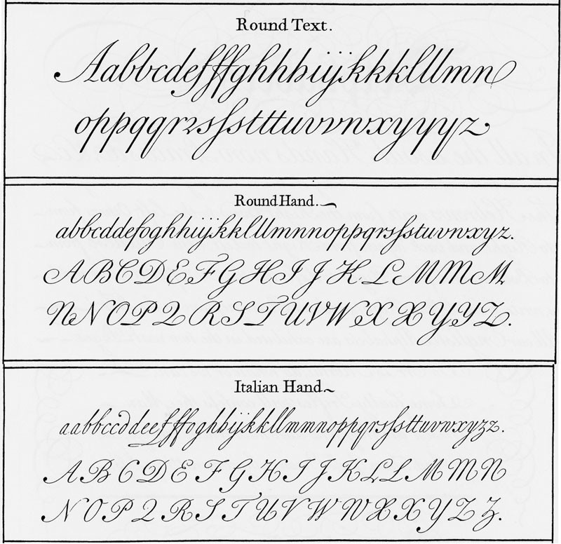
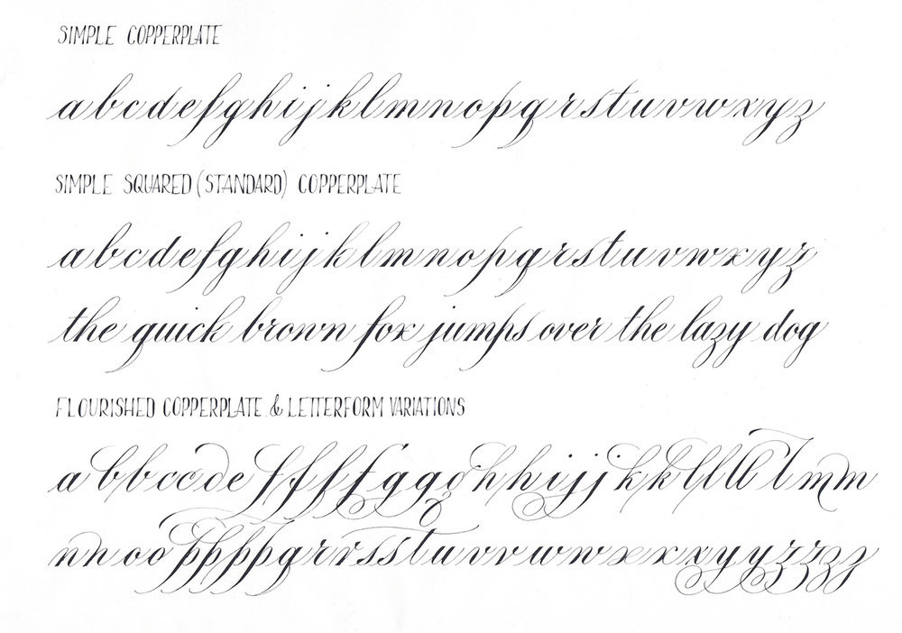
@freemo ☺️ Thank you. I saved the photos. I will write the individual strokes as faithful to the example as I can!
@vital876 Feel free to keep in touch and ask any questions if you need help. there are tons of resources and communities out there. Some of the best scribes in the community love to give away resources and advice and any teach classes (they are so generous it is virtually free for most of it).

@freemo do you have a geometry/construction sheet for the full r?
Different teachers preferred or required different styles for other letters but not r in my upbringing. I learned at different times two cursive forms for G and three for x.