
Looking for feedback on a new site I'm writing. I just tweaked the fonts throughout the site after some preliminary suggestion. Are the font sizes and types good now?
PS Please leave any additional comments or suggestions about the site in comments, looking for any feedback I can get.
@wilmhit Off in what way?

@freemo Font types like this might look unprofessional. Probably every other fintech/crypto website uses verdana or something boring like that.
@wilmhit ive tried a more standard font and it feels to "blocky" let me try verdana
@wilmhit Ok I changed the font type, what about now.
@freemo yeah that looks better
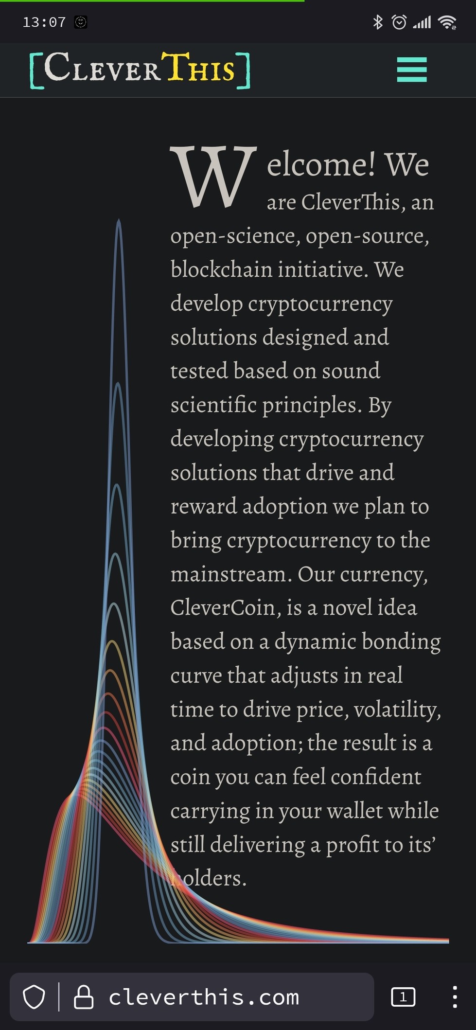
@freemo also first letter in bottom row is covered by the graphics on mobile
@wilmhit darn thought i fixed that, new font must have broke it
Is it fixed now?
@zleap does the problem you describe happen if you make the window smaller and then refresh? Should only happen if you resize (which isnt very common but i do intend to fix it)

Size is good, contrast is good, but, style... mmm... "medieval" (serifs) style for crypto? i don't know...
The titles support medieval style for crypto "credibility" (it's an option), but the the readable text... isn't necessary. In my opinion.

@SneedsterSpeedster Thanks for the input. Probably looks that way because it is a serif font

@freemo i'd go with an even smaller color palette. i like the two greenish blueish, but the red icons are a bit off. that's highly subjective though :)
@bonifartius The reds actually were a holdover from some code I imported that I decided to keep. So I was a bit iffy about it myself.

@anonymoose Thanks ill try that.

@freemo
1. Text in the search bar should probably be left-aligned, not centred
2. Search results are empty even if I search for text I see in your posts
3. Possessive "its" shouldn't carry an apostrophe
4. The icons under "News and Events" confuse me - I can understand why the article might be represented with a scroll, but not why the roadmap gets a church or the other article gets a parcel
5. Using GitHub's logo for GitLab links is probably frowned upon by the IP holders
6. Dunno what the icon resembling a pair of pillows is meant to signify
7. None of the links in this section are News and Events anyway
8. "comming soon" -> "coming soon"
9. "12th st." -> "12th St."
10. A direct link to the Matrix channel might be nice if possible
@khird Thank you very much... The text is just filler for now but the other comments are particularly helpful.

Also, I'd put the menu options in a footer as well.
@realcaseyrollins Thanks for the feedback, much appreciated.

@freemo it just looks a little off to me. But definitely readable