

@fikran
The ratio of the different parts of the letter. I wrote thr scale on the right hand side illustrated it. The top part is 5 units of length, middle 3, bottom 6. It defines the proportions of the script.
@fikran
The specific ratio i picked is arbitrary. But the idea that you can vary the look of a script by changing the ratio is common yes.
The style here is Copperplate, specifically the Italian Hand variant. You can pick whatever ratio you'd like to write it in but some look better than others of course.
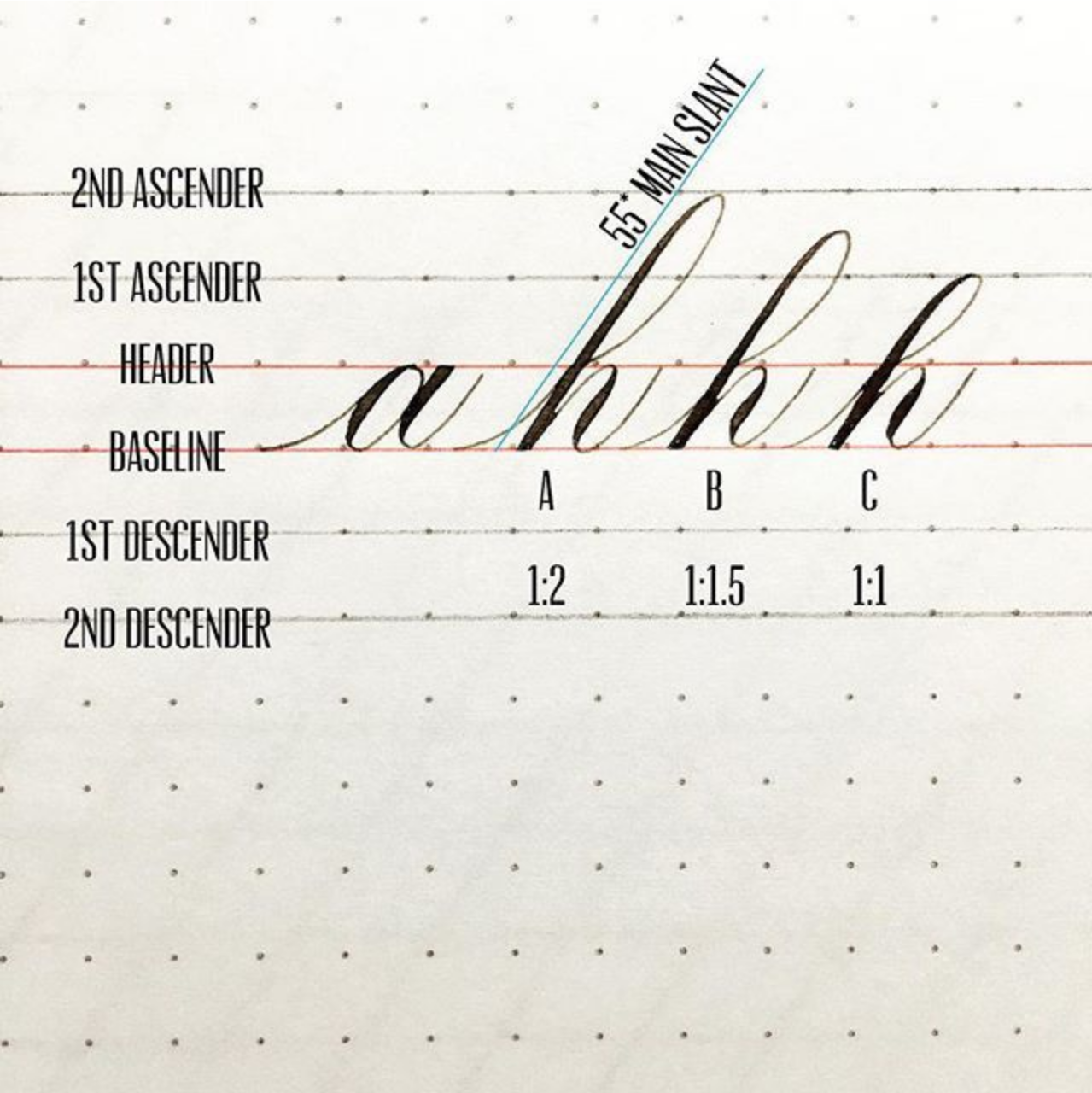
@fikran
Here is an example (not by me) showing the letter h in 3 different ratios for comparison. Since h doesnt have a descending portion its 2 part ratio instead of the usual 3 part ratio

Rant
@freemo @calligraphy had to do calligraphy in school. Hated that shit. I got no skill for hand writing or drawing. If you need evidence of clear bio differences in natural ability then look no further than a 3rd grade classroom, some kids be out there drawing monalisa looking shit and then you have people like me that can't write a "T" without it being crooked, bent and fucked up.
Rant
My handwiting for most of my life up until a few years ago was probably worse than yours. Took me a **lot** of practice to get this far and I'm still nowhere near where the pros are.
Rant
@freemo @calligraphy where do you get the patience and motivation from? Or is it adderall?
Rant
I did most of it when i was still recovering from my broken spine and was stuck in bed all day.
Since I recovered I practice far less but thankfully I do it enough to keep the skill I gained and still slowly improve.

@zpartacoos @freemo @calligraphy
I do handwriting on very personal or important documents. The aesthetic effect is its own reward for me. If it were just notes or a grocery list, I wouldn't have bothered and it'd look like chicken scratch. I've written drunk notes that couldn't be deciphered sober in plain writing- but could be easily read in cursive.
@lucifargundam
Same, i still have my chicken scratch ready to go
@zpartacoos @calligraphy

@freemo Is that supposed to be a kizmet or kismet?
@trinsec since when does the letter s have a descender?
@freemo Since I never heard of a kizmet and wasn't sure what you wanted to write there.
@trinsec Well I never heard of a Trinsec before but you dont hear me complaining :)
@freemo In other words, you even typo when doing calligraphy. Got it. :P
@trinsec haha, nah I knew the error, i needed a letter with a descender to practice the ratio, and z is a fun one.
@lucifargundam
That exists, its called comic sans
@trinsec
@freemo @trinsec
_You_ created comic sans....? Last I checked your name wasn't Vincent Connare.
https://en.m.wikipedia.org/wiki/Vincent_Connare
@lucifargundam
Dont tell me what my name is!
@trinsec
