

🎓 Doc Freemo  🇳🇱
@freemo@qoto.org
🇳🇱
@freemo@qoto.org
- UFoI Member
- http://UFoI.org/u/freemo/
- Website
- http://JeffreyFreeman.me
- Gitlab
- https://git.qoto.org/freemo
Admin
Jeffrey Phillips Freeman
Innovator & Entrepreneur in Machine Learning, Evolutionary Computing & Big Data. Avid SCUBA diver, Open-source developer, HAM radio operator, astrophotographer, and anything nerdy.
Born and raised in Philadelphia, PA, USA, currently living in Utrecht, Netherlands, USA, and Thailand. Was also living in Israel, but left.
Pronouns: Sir / Mister
(Above pronouns are not intended to mock, i will respect any persons pronouns and only wish pronouns to show respect be used with me as well. These are called neopronouns, see an example of the word "frog" used as a neopronoun here: http://tinyurl.com/44hhej89 )
A proud member of the Penobscot Native American tribe, as well as a Mayflower passenger descendant. I sometimes post about my genealogical history.
My stance on various issues:
Education: Free to PhD, tax paid
Abortion: Protected, tax paid, limited time-frame
Welfare: Yes, no one should starve
UBI: No, use welfare
Racism: is real
Guns: Shall not be infringed
LGBT+/minorities: Support
Pronouns: Will respect
Trump: Moron, evil
Biden: Senile, racist
Police: ACAB
Drugs: Fully legal, no prescriptions needed
GPG/PGP Fingerprint: 8B23 64CD 2403 6DCB 7531 01D0 052D DA8E 0506 CBCE
Joined Jul 2018
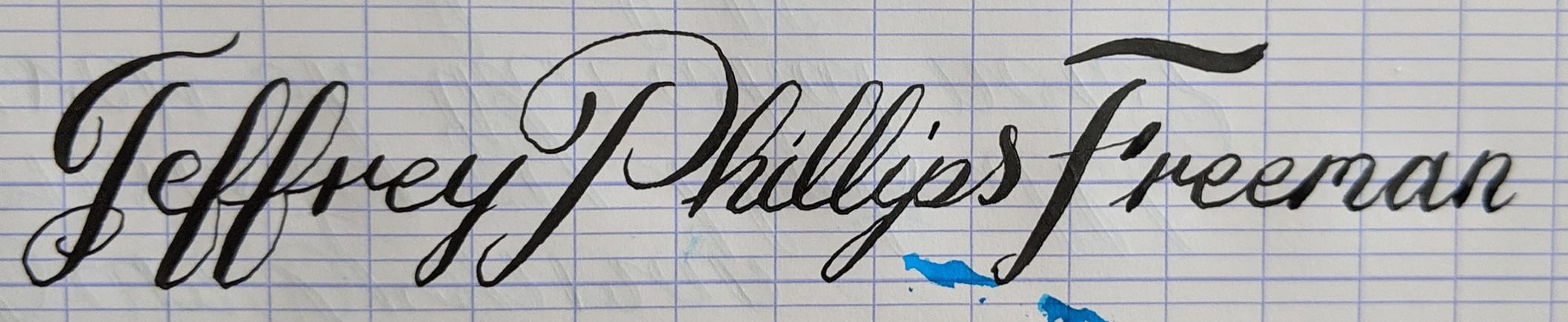
Trying a new variation on my Copperplate script. Im trying a double-f variation that also makes for a. Interesting lead in to the "r" in my first name. Thoughts?
Also the capital F is new but still needs some work.
#Calligraphy #handwriting #writing #penmanship #cursive #Copperplate
After a day worth of practice I have incorporated a few. New style idea I to my signature.
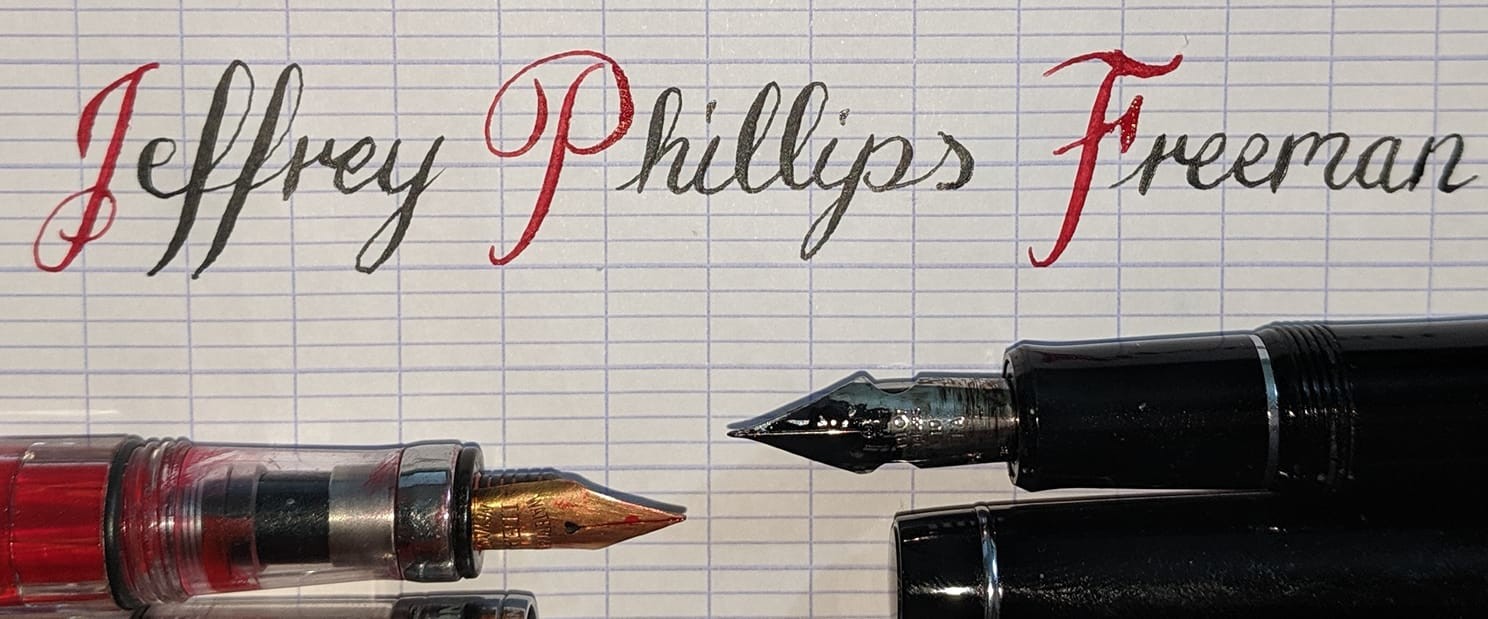
A comparison of the flex / style across 3 of my flex pens. The first I made myself from a 120 year old Waterman nib. The second is a stock falcon pilot, the last one is my hand customized Custom 912 (With Motishaw Spencerian modification)
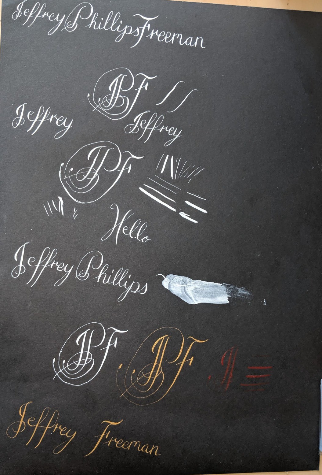
My first real attempt with a dip pen, let alone an oblique dip pen. Gold and white lettering on black.
I decided to ink up my $200 franken pen (with a 120 year old nib) against my modern $600 hand customized pilot (Motishaw Spencerian modification).
This is the end result, each in a different color ink.
#Calligraphy #FountainPens #writing #Handwriting #Spencerian
My first attempt at an illuminated text using 13th century script called Textura Quadrata.
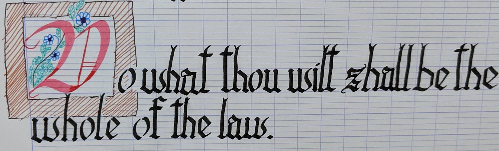
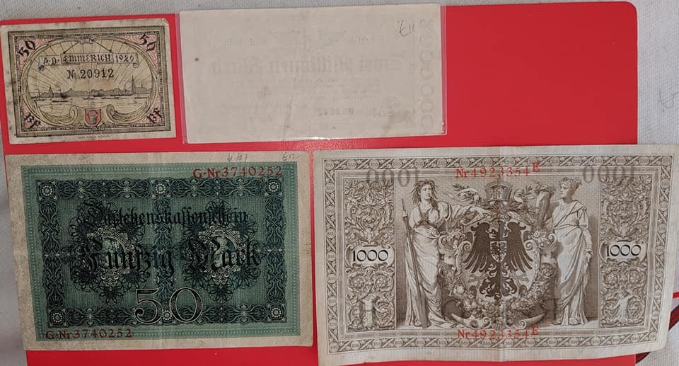
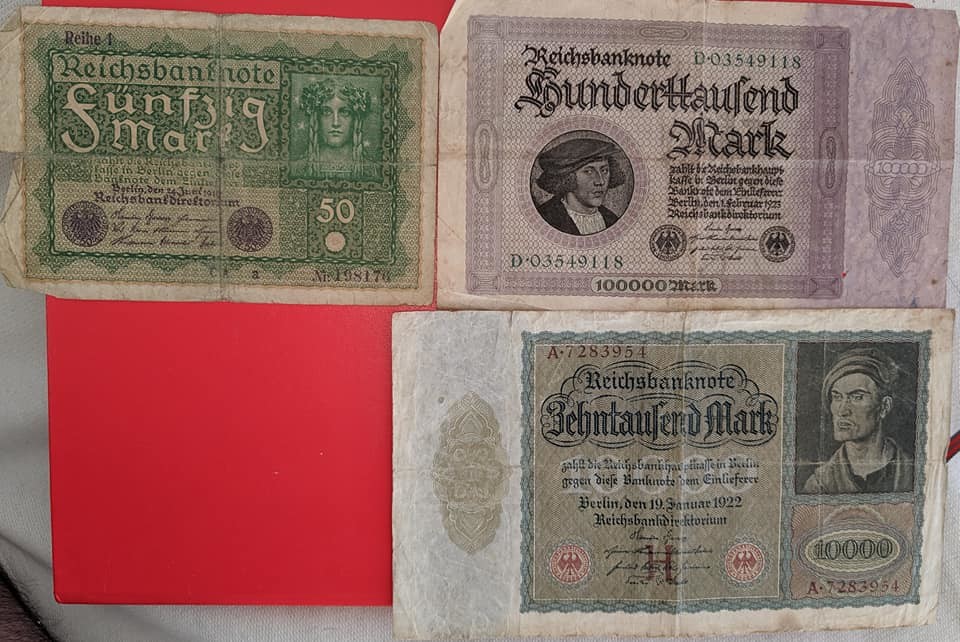
Picked up some lovely money from pre-nazi Germany, the Weimar Republic as it was called. It was all very cheap and not a good investment or anything. I picked it up because if the lovely examples of calligraphy.
Most of these are from 1920's around the same period in germany.
Playing with white and gold ink on black paper. Really love it.
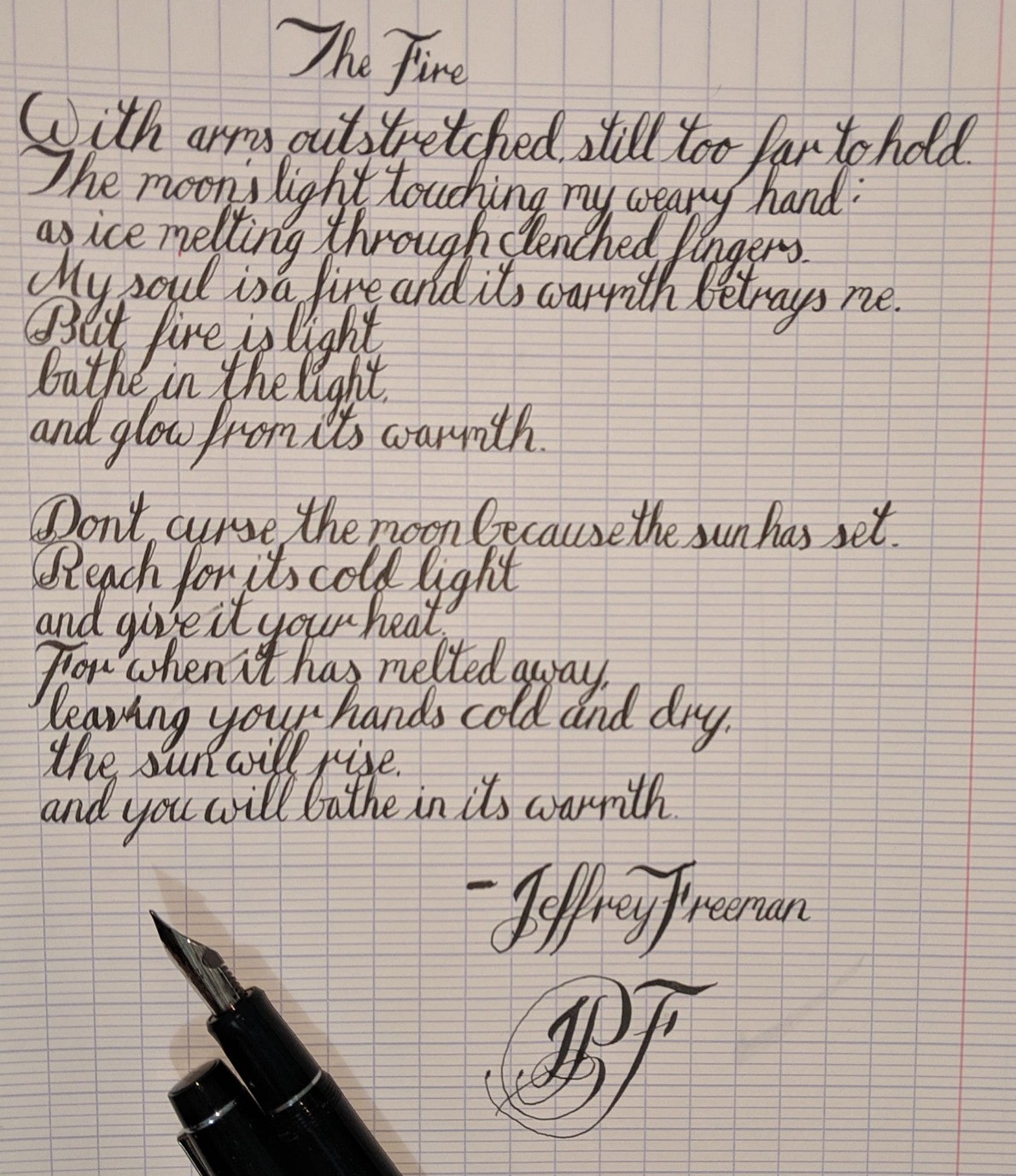
An attempt at writing my shortest poem in Copperplate
While i can see many of the imperfections in my writing I'm still not sure how I could train do to improve it. Suggestions always welcomed.
#poem #poetry #english #calligraphy #handwriting #copperplate.
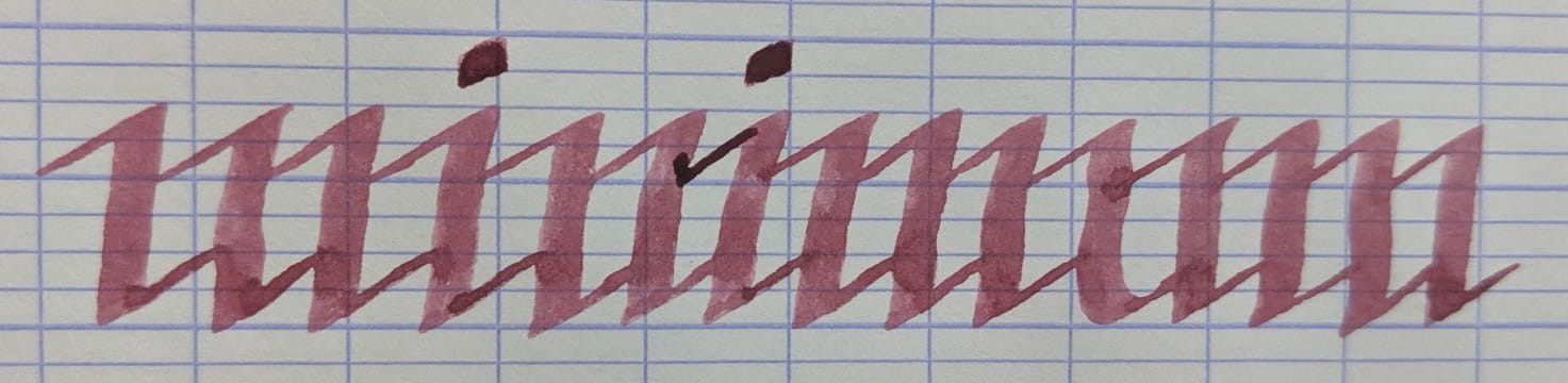
A mini-mom of minimum might.
Written in Blackletter Gothic Textura script from 14th century.
A lot of people liked the last post so after a bit of practice here is a slightly improved version that is a little cleaner and more consistent
So a new variation on the word "minimum" written such that it is the same right side up as it is upside down. It is intentionally very hard to read.
For shits and giggles an even harder to read version. of my last post. Same script but with the spacing removed just for fun.
Haven't done any gothic lettering in a while. Tried a new style i had an idea for just now. Thoughts?
Anyone out there want me to write a personalized letter and send it to them for s snail mail penpal, let me know. If i get a flood of requests ill pick just one or two.
#english #handwriting #calligraphy #copperplate #penpal #writing
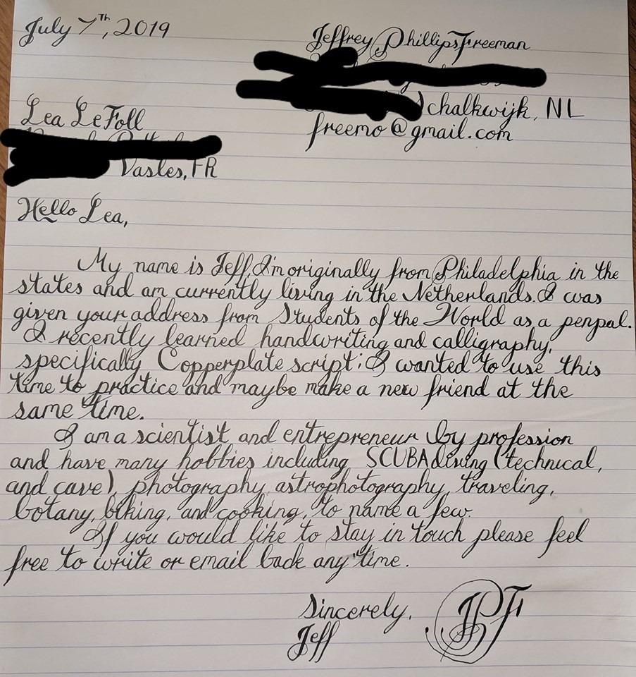
Finished writing my second penpal letter to a new person in France. I think I already see my handwriting improving through this exercise I think I'll keep you to it. Also still digging this deep black ink. My monogram has improved too!
- UFoI Member
- http://UFoI.org/u/freemo/
- Website
- http://JeffreyFreeman.me
- Gitlab
- https://git.qoto.org/freemo
Admin
Jeffrey Phillips Freeman
Innovator & Entrepreneur in Machine Learning, Evolutionary Computing & Big Data. Avid SCUBA diver, Open-source developer, HAM radio operator, astrophotographer, and anything nerdy.
Born and raised in Philadelphia, PA, USA, currently living in Utrecht, Netherlands, USA, and Thailand. Was also living in Israel, but left.
Pronouns: Sir / Mister
(Above pronouns are not intended to mock, i will respect any persons pronouns and only wish pronouns to show respect be used with me as well. These are called neopronouns, see an example of the word "frog" used as a neopronoun here: http://tinyurl.com/44hhej89 )
A proud member of the Penobscot Native American tribe, as well as a Mayflower passenger descendant. I sometimes post about my genealogical history.
My stance on various issues:
Education: Free to PhD, tax paid
Abortion: Protected, tax paid, limited time-frame
Welfare: Yes, no one should starve
UBI: No, use welfare
Racism: is real
Guns: Shall not be infringed
LGBT+/minorities: Support
Pronouns: Will respect
Trump: Moron, evil
Biden: Senile, racist
Police: ACAB
Drugs: Fully legal, no prescriptions needed
GPG/PGP Fingerprint: 8B23 64CD 2403 6DCB 7531 01D0 052D DA8E 0506 CBCE
Joined Jul 2018
