

… or that we're just autistic, me and you, @Blort
TBH I'm only half-joking, I've never went to be checked by a professional.

@mcsinyx
Well, it's a spectrum, so I'm a sense, pretty much everyone is somewhere >0 on the spectrum. The only real question is, how far?


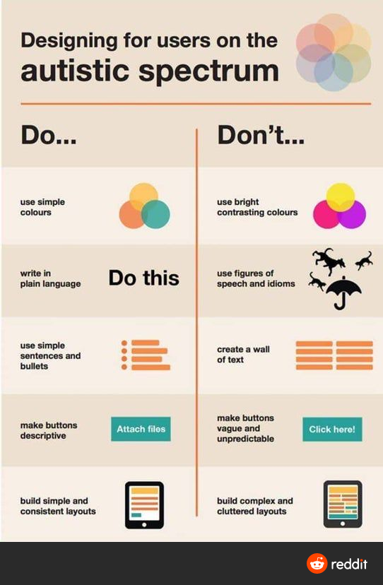
@TheBuilder Why? Do you disagree? BRIGHT CONTRASTING COLORS are actually pretty distracting.
@lupyuen
@lupyuen I can totally relate right there. But isn't this the case for about everybody anyway?

@zleap Yep they look flashy ... But bad for accessibility
@zleap let's tell them it's bad! 🙂

@lupyuen
Sounds like good practice for designing for humans in general...