

Bob Kerns @BobKerns@qoto.org
Joined Nov 2022
@securescientist @ct_bergstrom
Let me add that I recognize that structuring the references would be at least partially redundant.
But redundancy isn’t always bad, and it need not always be redundant.
People do NOT generally put explanations of the purpose of a reference inline in the text. Sometimes they might in a footnote, but in the text it would make it hard to read.
Tagging references with tags like “background” or “source” or “evidence” would not usually be redundant, and not burdensome.
But would be very helpful to me, the reader.
dataviz: consistency of data collection
@beadsland A lot of the chaos I saw was from there being no shared process at all, which too often opened it to political manipulation and wishful thinking.
Sure, we always have to adjust the data to mitigate inconsistency. And then total laymen will come along and accuse us of “manipulating” the data. Having followed influenza data for year, I just expected more planing and preparation than turned out to be the case. I’m convinced we could have done better—but not by making decisions state-by-state and county-by-county on the fly.
I’m reminded of when ocean temperature data showed an unexpected rise. It was traced to a change in how measurements were collected—manual over-the-side measurements, vs engine cooling water inlet temperatures. Easily adjusted for when identified. Climate deniers screamed about the adjustment!
I once lit into David Sirrota for publishing a number—% of donors with oil ties, but stripped of the context that Beto was running in a state where much of the population had oil ties, and his comparisons were not. He INSISTED he was JUST REPORTING THE FACTS, doing data journalism. But stripped of context, it ceased to inform and instead mislead. A statistic is never just a number (and it’s a stand in for a probability distribution, but let’s not get into that).
I felt vindicated when he later went to work for the Sanders campaign!
I always wanted to do a visualization of how COVID case rate curves evolved with time, as reports came in with varying delays. The delays were part of the situation often ignored, leading to premature gloating of “progress”.
I didn’t overcome the challenge of locating the necessary “time series of time series datasets”. I should have bit the bullet and collected it myself, collating the periodic individual time series.
So of course, I love your quote, and the mortality data it gives! Epi model predictions in general are self-invalidating, to the extent anyone pays attention and acts on them, changing the situation.
And then, of course, that becomes “evidence” that the models are “wrong”.
Anyway, i do understand how challenging data collection is. I didn’t mean to suggest that I expected consistency. I just expected that influenza surveillance would have been a template that would have saved a lot of early iterations. A new reportable disease isn’t really a new situation.
If US lawmakers had funded an international effort on emerging disease surveillance, I have little doubt it would have existed.
dataviz: availability of data
@beadsland While many issues rest in the hands of local decision-makers, my thinking goes toward establishing standards of care. And also, identifying excellence.
Yes, it absolutely becomes about data collection. I’ve been disappointed in our data collection at every turn. I expected we had more to build on from global influenza surveillance, Inconsistent categorization ran rampant and was frequently changed.
The middle of a crisis is no time to be sorting these things out, but people heroically did their best, except for the politicians who should have funded the preparation in the first place!
I don’t think non-data people really appreciate the value of consistent collection practices. Consistent both between reporters and longitudinally.
But I preach to their choir here.
@securescientist @ct_bergstrom Yes, I didn’t describe the problem well. Sorry for the confusion.
When the set of references is small, you do get useful context from where in the article the citation is referenced. But it’s in a very inconvenient form, and the signal is often pretty vague.
But with large lists, it falls apart entirely. A single sentence may have 10 references, and half may leave you scratching your head. Some may conflict with the paper’s result or with each other.
With over-frequent references sprinkled through the text, it reduces any contextual clue to either extremely fine grain, suggesting narrow value, or very little signal.
Going forward from reference to the citation works poorly. You start with context but lack title, which is usually a stronger clue about why unit was cited.
I find it more productive to work from the list of references (after reading the paper (usually)). Rather than searching for the citing context, I find it faster to just click through to read the abstract and make my own assessment..
But none of it is organized to support my task. It’s organized to support the argument, which is fine, but checking that isn’t usually my task.
Back when references weren’t hyperlinked, my strategy was different. Even with Wikipedia, I make more use of the citing context, either clicking through or searching back.
But Wikipedia, the reference titles are often quite uninformative, and the lists are usually short.
With unhyperlinked articles, the labor to track them down was the limiting step. It was worth the additional effort to narrow my search, and reference lists were usually not overwhelming.
And often I’m looking for background on a topic I don’t know well, not the specific point a reference is supporting.
I don’t quite fit the target audience, so often the contextual clues of the original point of reference, are quite useless to me. Even if I understand them perfectly, the clues don’t relate to my goal.
So a large fraction of the time, I just click on articles with promising-sounding titles, avoiding meta-analysis if possible (for reasons). It works pretty well if the references aren’t being padded.
This has probably left you no less confused before. But people approach reading papers with different strategies for different goals, and that holds true for perusing the references as well.
@securescientist @ct_bergstrom
As one who is often a novice reader in a variety of fields, a long list of citations is far from helpful. I’m not going to read them ALL. Instead of a long flat list, if you gave it some structure—some guidance on *why* each paper is cited. Titles are not enough. And of a dozen on a particular topic, which are high-quality?
dataviz: regional stress in national context
@beadsland That’s a very good point! Is data available on physical vs staff capacity? Even that obscures equipment limitations, etc.
The ultimate reason to ask these questions, is to marshal the needed resources to fix them. Major capital expenditures vs staffing have very different pathways.
@freemo @realcaseyrollins @Gargron @serenebabe @ceoln
That’s part of why I spoke up! Often, “loud” is mistaken for public opinion, and “loud” is often far removed from what is right. That’s how silence becomes complicity.
So here’s my voice trying to bring “loud” back toward what’s right.
@freemo @realcaseyrollins @Gargron @serenebabe @ceoln
It’s unfortunate that qoto is no longer listed on joinmastadon. When I recently joined, I scrolled through that whole list, finding everything either too specific or lacking in moderation. LaTeX support was a bonus.
I didn’t know anything about Mastodon, and didn’t know how to make the choice.
But on reading your history w/ Snow, and your compromise of silencing but not blocking domains, I realize I made the right choice.
While cishet myself, I’ve been an ally for 50 years. I want no part of bigotry, but also recognize the occasional need to monitor what bigots are up to.
It’s unfortunate my fellow Twitter refugees are not being given the same option.
adult hospital & ICU capacity map USpol
@beadsland Right, I should have said “when I need to be in the ICU”. And yes, “occupancy” is the word I was looking for.
I’m just trying to tease apart the different factors. We can’t do that with a single color scale. Specifically, ‘where is ICU load high relative to population” vs “where is ICU occupancy high because of inadequacy + COVID + other Influenza-Like-Illnesses”.
The first is a better indicator of prevalence; the second a better indicator of the impact of health inequity.
As for rural areas, I was assuming we’d apply the same technique of defaulting to the state values if in-county ICU capacity is not there or minimal.
There are, of course, demographic factors such as age, employment (farm vs sweatshop, to pick extremes) in our multivariate space. These might affect appropriate ICU levels, in different ways—accident rates, disease transmission.
But to begin to answer my two questions, starting from ICU capacity, we need to disentangle adequacy.
I could take a stab at some visualizations; I’m sure I can find county population data easily enough. But attending to my medical issues takes most of my time these days, so I can’t promise anything.
But I wanted to hear your thoughts before trying anything.
Thanks.
adult hospital & ICU capacity map USpol
@beadsland I’d like to see this adjusted by population in a couple of ways.
One to highlight where there was preexisting undercapacity (under-served areas), and another to highlight where utilization is high relative to initial supply.
If you use a national average per-capita number of beds as the denominator, I think you get the latter, because it removes local supply from the equation.
For the first, perhaps subtracting the local shortfall from the denominator/adding the local surplus? This is an artificial metric; it gives a mix of signals—adequacy + disease burden.
Another way to mix might be to subtract normalized utilization from the actual utilization.
Raw utilization itself is a mix of capacity adequacy and disease burden. This leaves me with the question of contribution of each of these factors, as well as how they may relate.
The existing map is ideal for answering “if I get sick, what will the situation be when i end up in the ICU”, which is certainly an important question to answer!
The idea that a brief poll of Elon-followers is “democracy” makes a mockery of the word.
Controversial opinion: we must heavily moderate public spaces to boost evidence-based insight & prosocial behavior, not enable the worst humans...
I’m with you on that!
Looking at the responses here, I went to block one guy, but did a bit of diligence to be sure I was reading him right, saw a guy even he blocked,, and ended up blocking an entire domain.
My first blocks on Mastodon. I found extensive blocking essential to a productive experience on Twitter. Looks like it will be the same here.
Bob Kerns
boosted

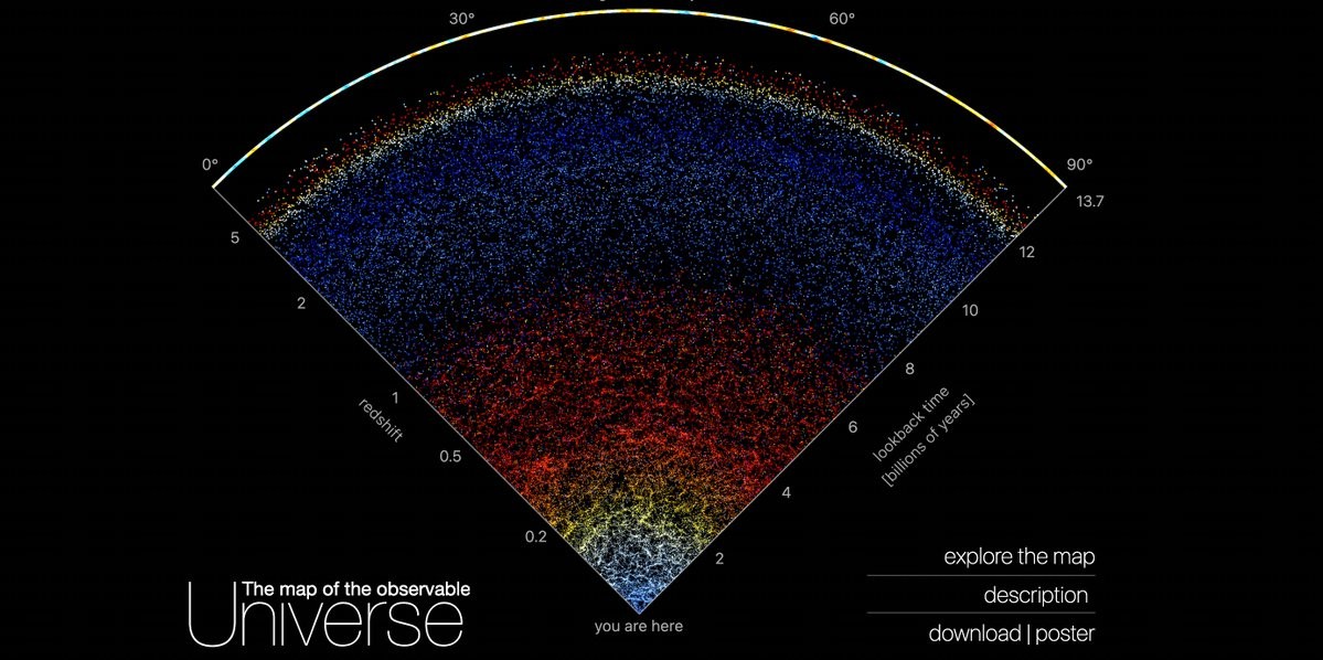
A group at Johns Hopkins has created a scrollable, interactive map of the entire universe, from here to the cosmic microwave background.
Extraordinary discoveries at your fingertips for free, unimaginable when I was a kid. https://mapoftheuniverse.net/ #astronomy #space #exploration
Bob Kerns
boosted

RT @a_longhurst
We are being desensitized to think that collective actions (#BringBackMasks) don’t have broad benefit for the common good. It’s only been 2.5 yrs since we lived by the motto: “flatten the curve”
Stunning to think how much solidarity has been eroded
https://bc.ctvnews.ca/b-c-baby-s-cancelled-heart-surgery-comes-as-respiratory-illnesses-create-long-waits-at-hospitals-1.6167978
Joined Nov 2022
