
Should I redesign the look of my personal website (check out the landing page and the blog specifically)?
@battlepenguin Good to know, thanks.

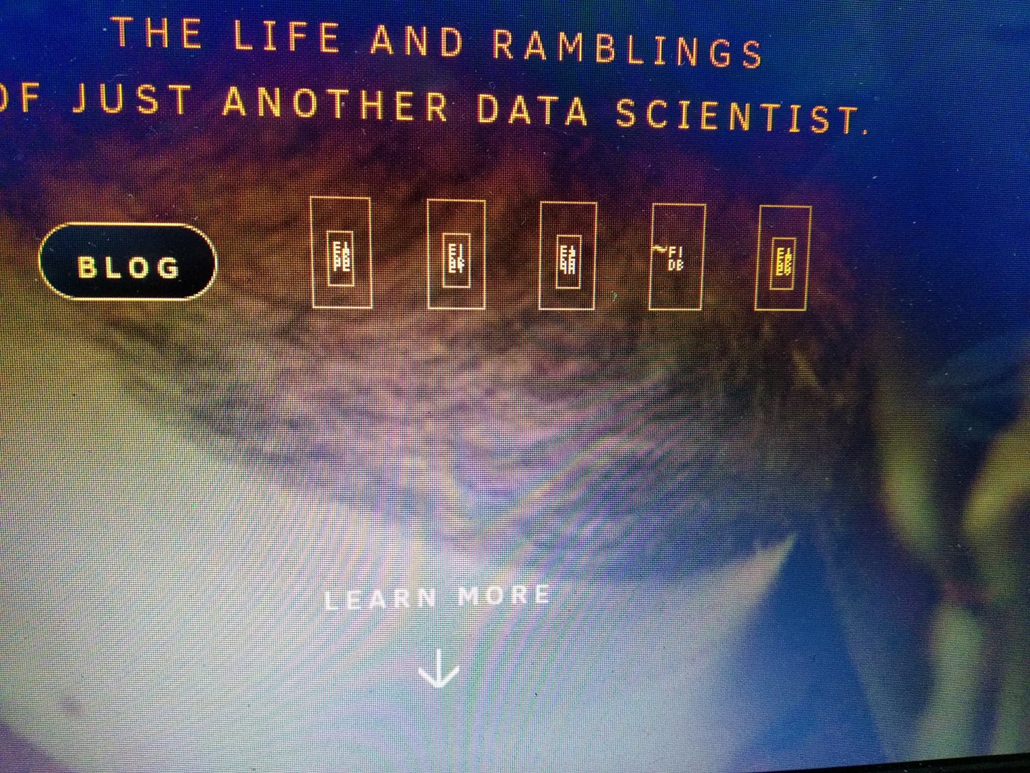
@mur2501 Ok, going to need to address that... I think its a font...

@freemo I keep feeling I'm missing some unicode there with those squares.
@trinsec yes for some reason your rendering it with a font that doesnt include the unicode for those characters.

@freemo
>landing takes too long
>Inconsistancy between landing and other pages are really bad
These are stuff i saw with my unprofessional eye but nice website overall
@lllillilll Thank you

@freemo when you say advanced mathematics, what do you mean?
@jmw150 College level and above.
@freemo Okay. The stuff on your pages and posts, is pre-college level for some people though. So it sounds especially odd.
I would change that to just mathematics in general. It sounds less obnoxious to me. As a professional, hearing "research" math, "theoretical" math, or "advanced" math, feels like either putting on airs, or other-ing. 😅
@jmw150 Yes most of my posts are geared towards teaching people entry-level concepts. It is not a reflection of the math I do as part of my career by any means. One thing im working on adding is my journal publications and other serious work for that very reason. Im just trying to think about how much and what to rewrite to add that in, as I dont find my blog the right place for it as that is oriented to the general public.

@freemo i am a fan of joomla, even though it’s horribly complicated in some regards, but i will never use wordpress again.. :) the landing page looks nice. interesting blog, didnt realize you mathed so much. also, have you read modern money mechanics? https://pennedout.com/things/banking/mmm.pdf ?
@ringo Thanks, I will check it out.
@ringo And no I dont think I read this one.
@freemo you’re welcome. its interesting. its a good read… =)

@freemo
I agree with @lllillilll about the clash between landing and other pages. Made especially stark by the suit-and-tie textbook font used for the blog and other pages, compared to the colourful and casual landing page.
@freemo
also, speaking of fonts, the font size used for the rest of the site seems too small IMO. And zooming in for some reason doesn't wrap the text automatically like in other sites, leads to the dreaded horizontal scroll bar instead (I'm too much of a CSS dunce to offer anything more than this "it no worky" comment though.)
@freemo
This is on Firefox by the way, in case it matters

@freemo Seeing this poll after closure and looking at your page from my Android phone. Some graphics aren't working. You should fix this.
@tatzelbrumm Thank you.

@freemo Looks good. I'd get rid of the font based glips at the bottom and replace them with SVGs. They don't show up on my browser.
Here's a history of all my websites:
https://battlepenguin.com/tech/a-history-of-personal-and-professional-websites/